Compromiso Mujeres Conscientes
Brand identity and visual system
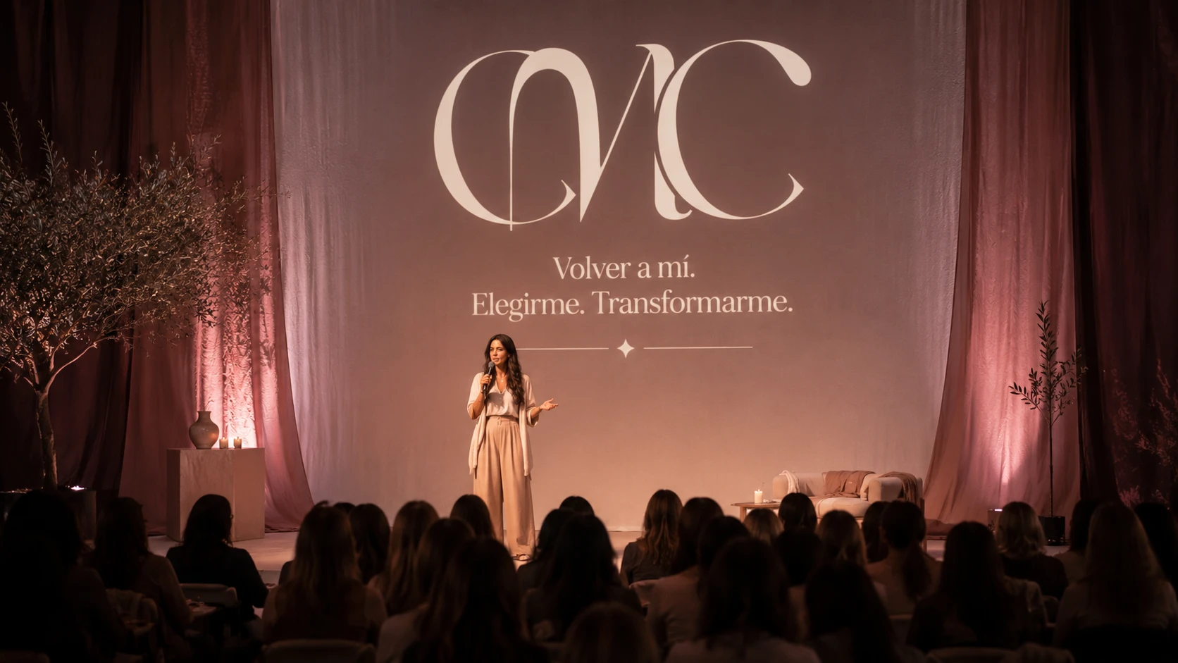
Coaching moves between two opposite and exhausted conventions: the corporate register of white and blue, and the basic wellness register of earth tones. The brand had to get out of both at once.
High income women who need to feel a distance between themselves and the coach stereotype. They are not after a promise of self improvement: they are after belonging to something bigger than themselves.
Compromiso Mujeres Conscientes (CMC) is a school and community for women’s personal development, guiding them through a process of change across body, mind and spirit. Its method, built on more than 25 years of multidisciplinary practice, stays away from quick fixes and holds space for deep, lasting work instead. The brand sets out to close the gap between knowing and being: turning connection, growth and conscious empowerment into something lived rather than something explained.
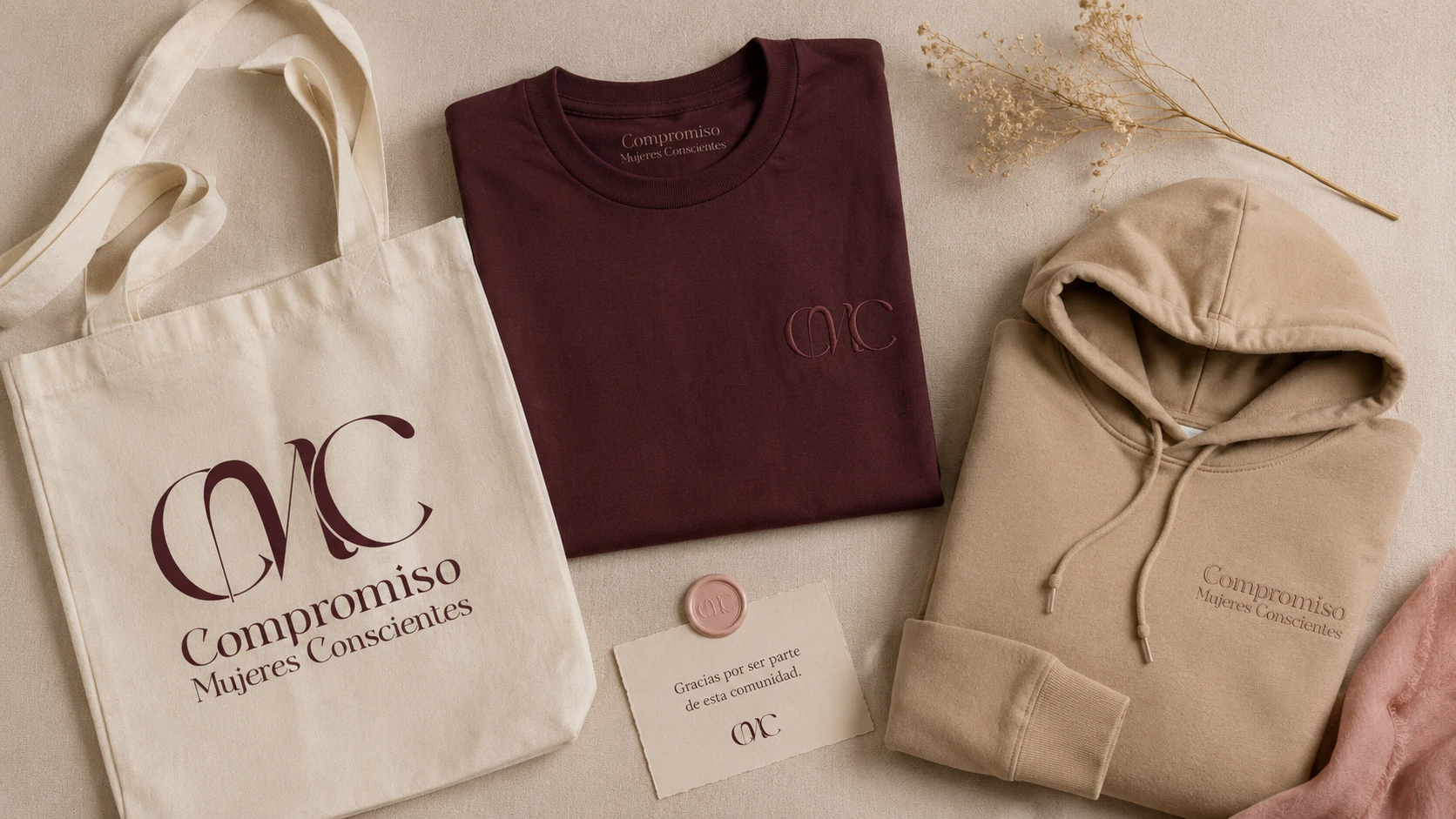
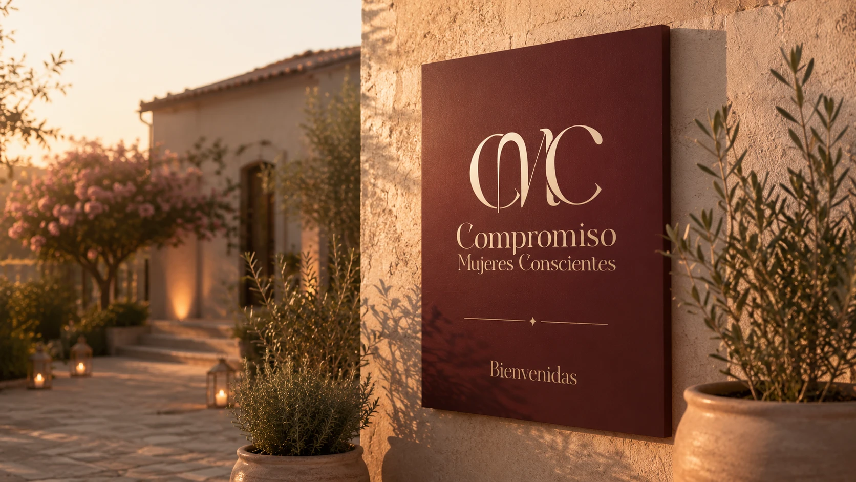
The visual system does not translate that idea using the vocabulary of the category. Coaching moves between two exhausted conventions, the corporate register of white and blue and the wellness register of earth tones and scripts, and CMC steps out of both by importing codes from fashion and editorial. The reason is that its promise is a different one: it does not sell self improvement, it sells belonging, and belonging to a world is exactly what fashion knows how to communicate.
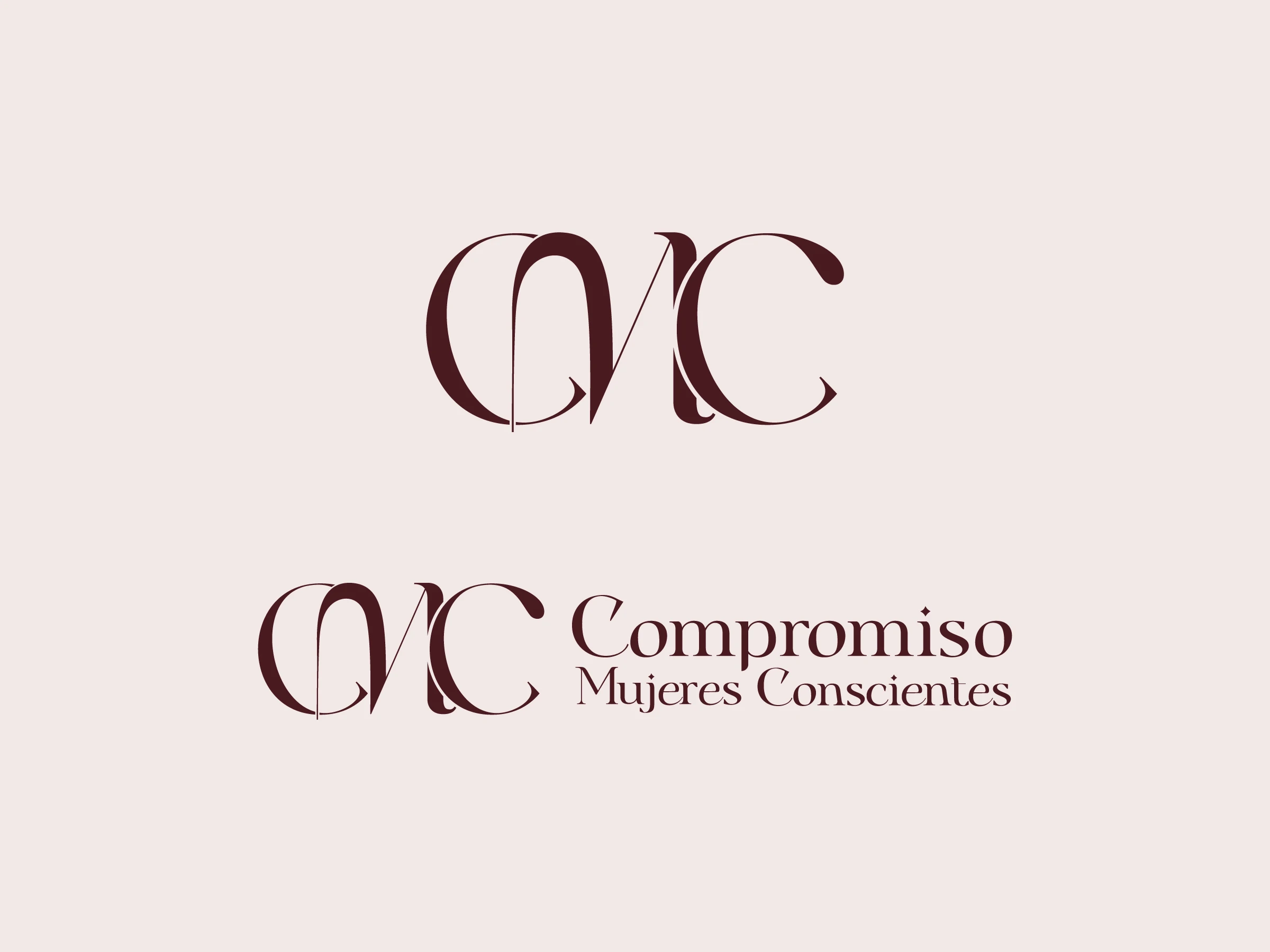
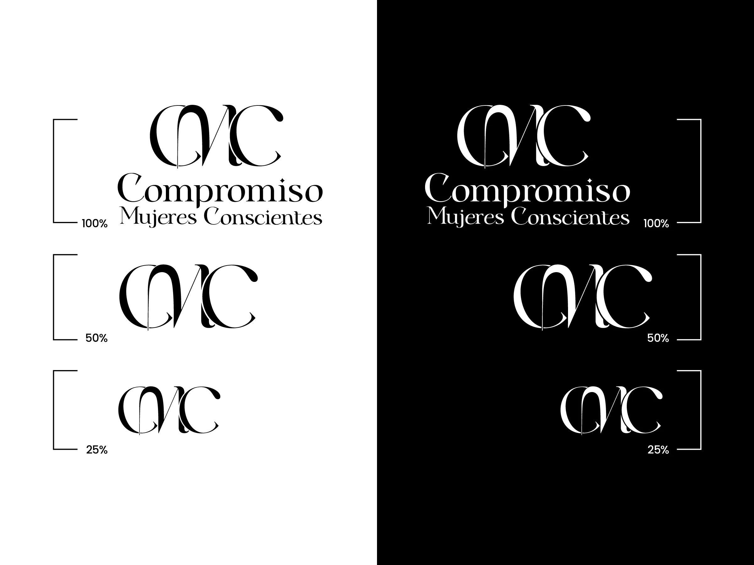
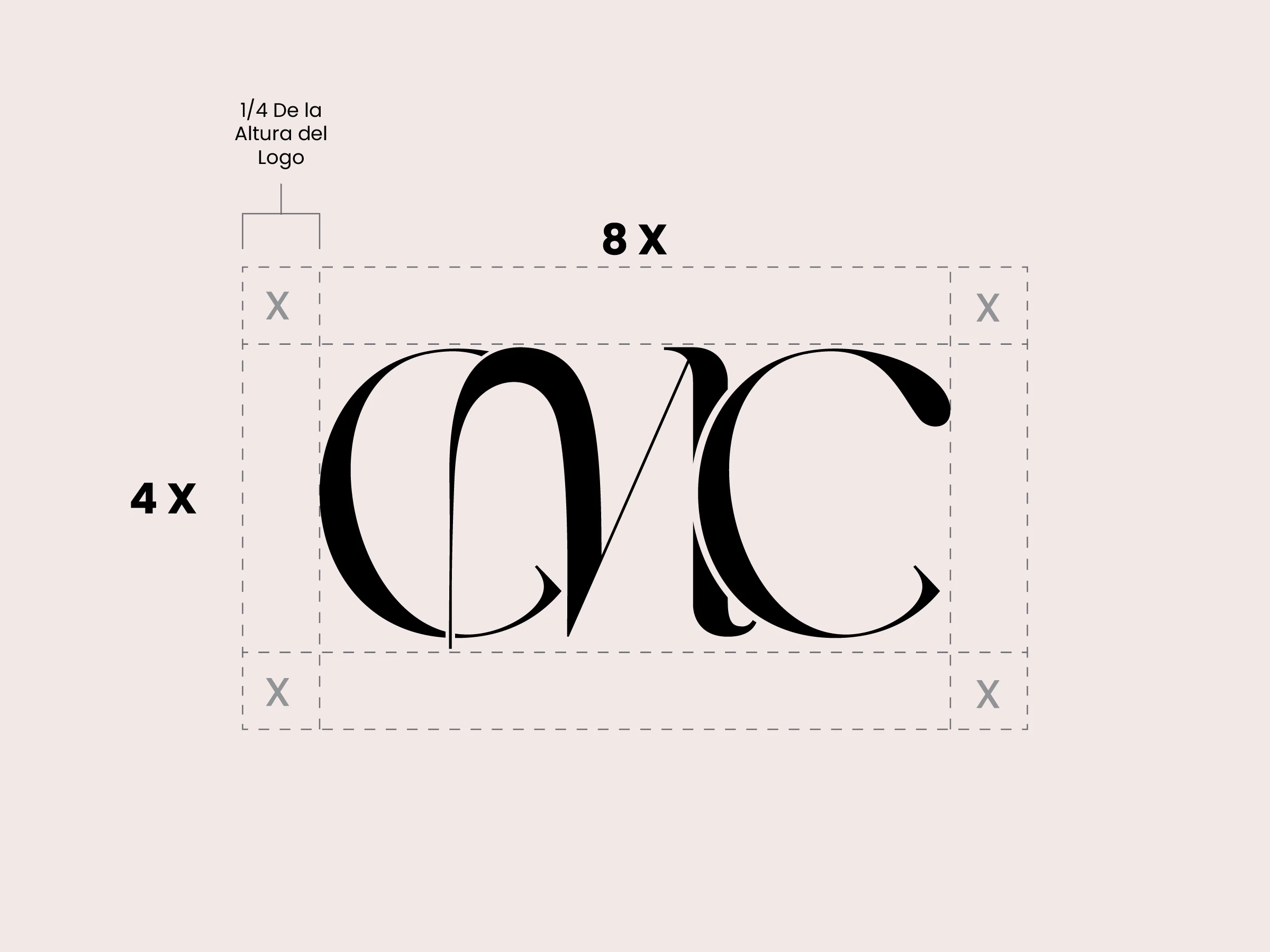
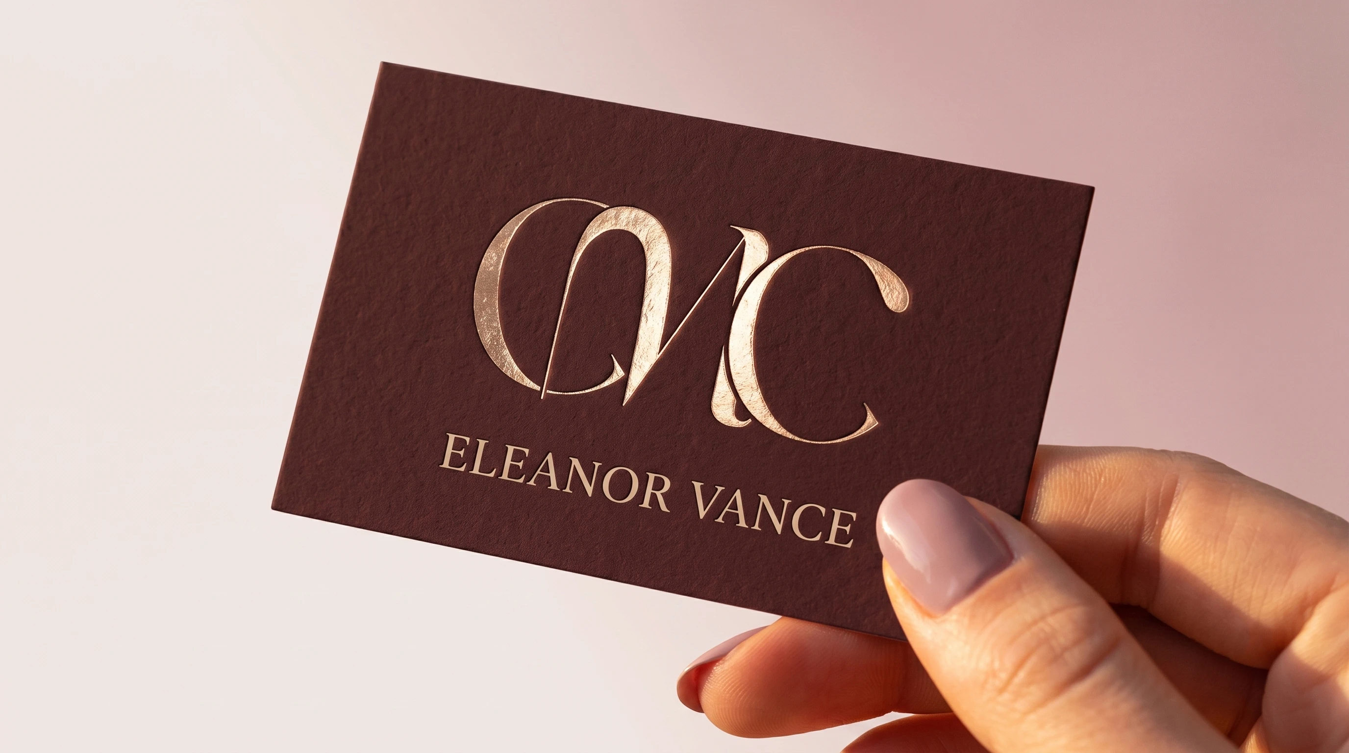
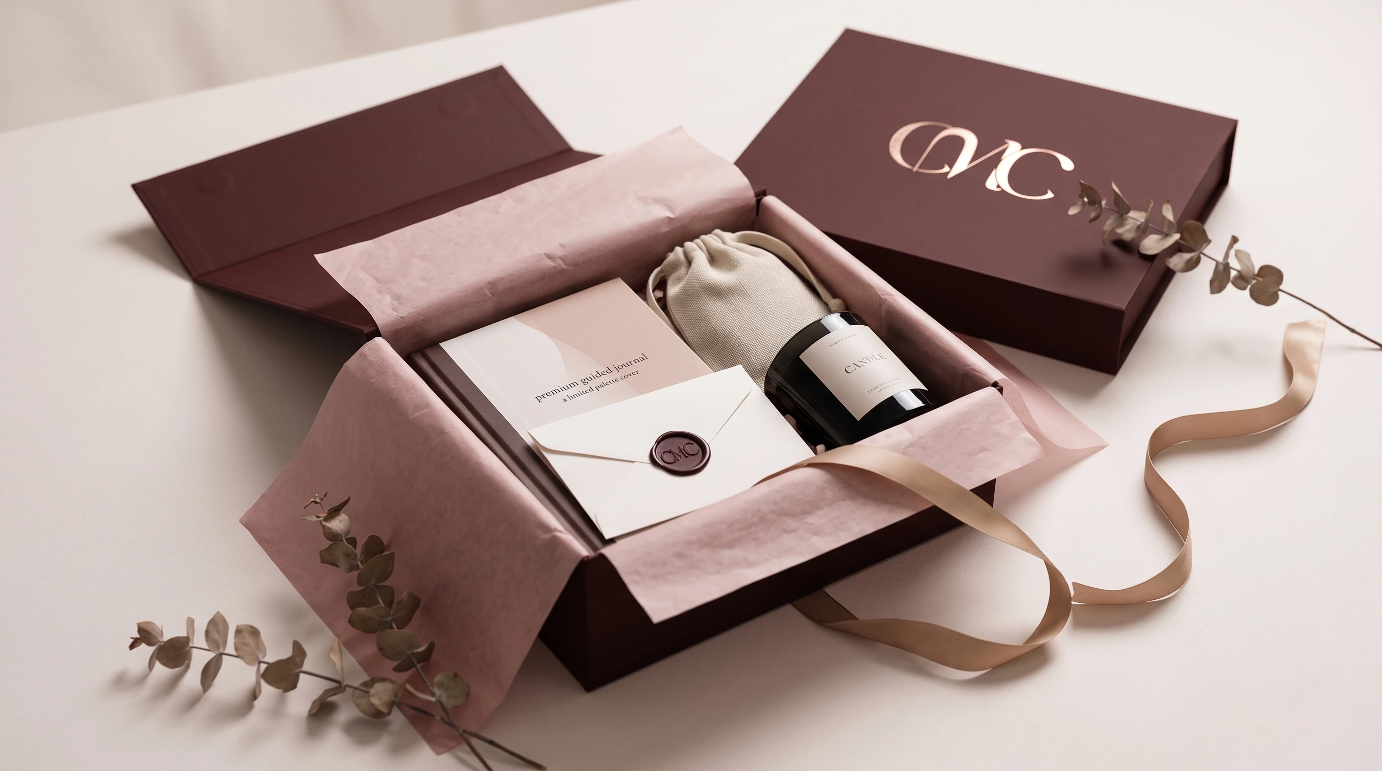
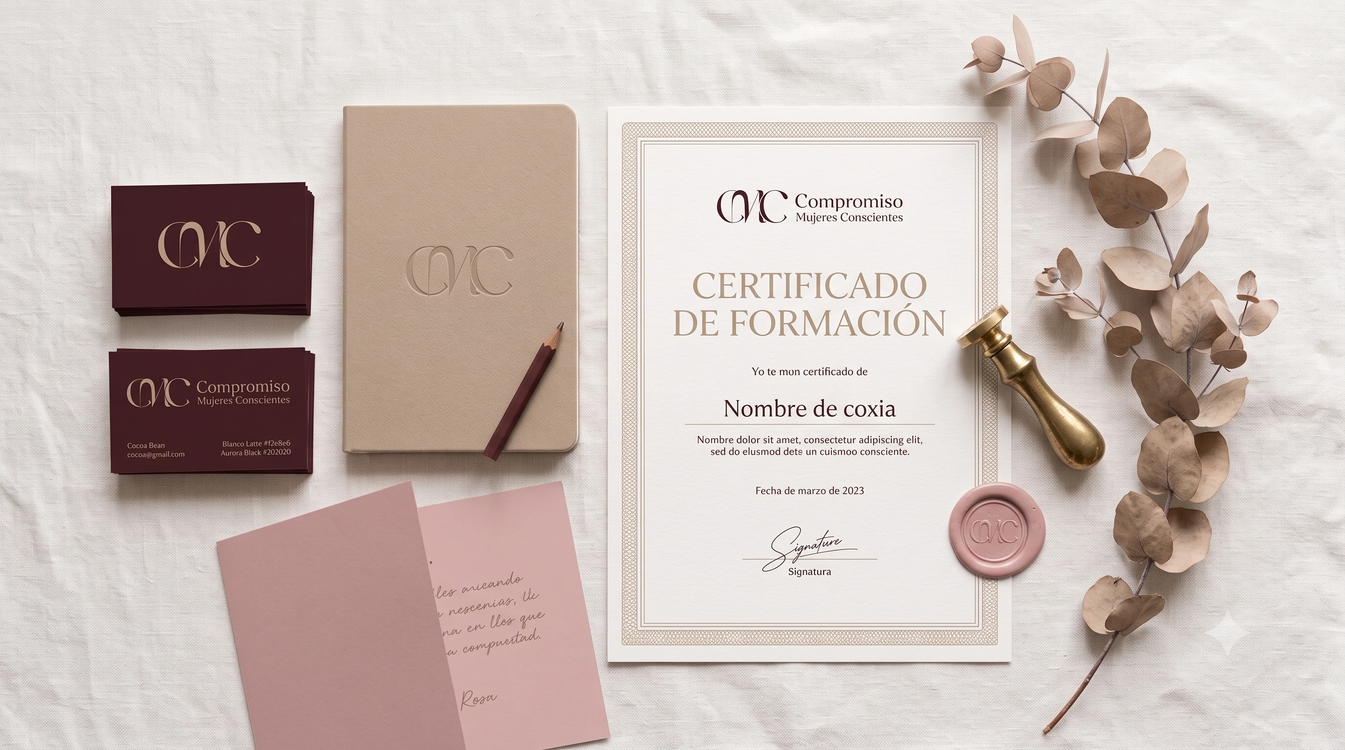
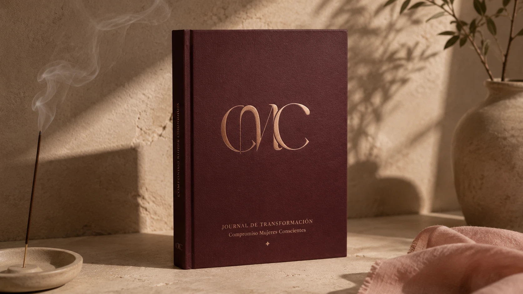
The mark comes out of that. A monogram interlaced through ligatures, working as a seal of belonging and making the weave between the women and their process literal. The wine red, the desaturated pink and the cream do not behave as earth tones: applied with high contrast type, set large and cropped, they read as quiet luxury. Color does not do that work on its own. The treatment does.
The monogram
The monogram is the device of belonging at its purest: crests, luxury houses, embroidered initials. It does not describe the brand, it marks whoever belongs to it.
The ligatures that interlace the initials make that idea of weave and community literal. It is simple, it reads as steady and serious, and it stays current.
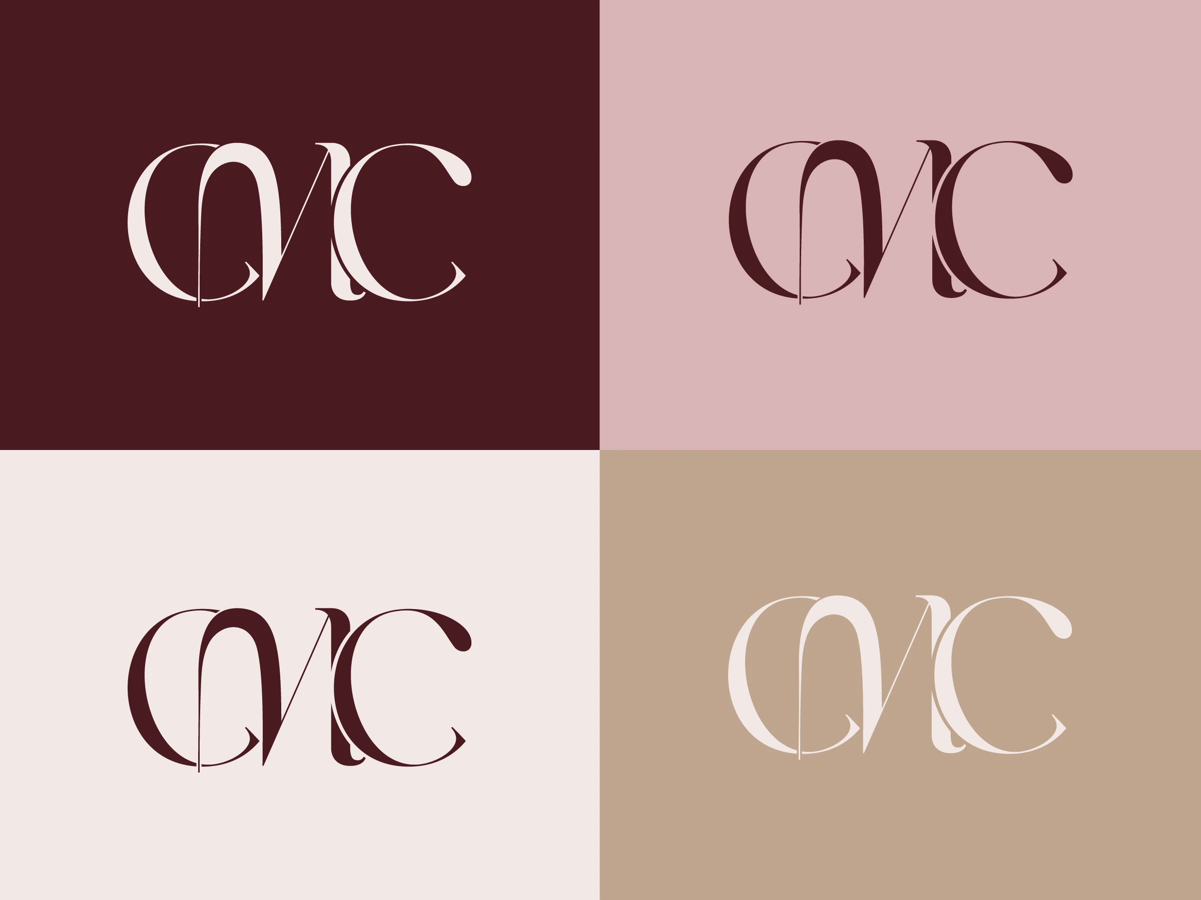
- BaseCocoa Bean#4A1A21
- SecondaryBeige#BFA58E
- SecondaryRosa#D9B4B8
- BackgroundBlanco Latte#F2E8E6
- ContrastAurora Black#202020


Process
How it was solved and what it was measured against
- Real client, small scale project
- The brand had to stand for Romina and her style, not for the category
Register
Fashion and editorial codes, deliberately imported into a category that does not use them.
Frente a: The corporate coaching register: white and blue · The wellness register: earth, green and scripts
Fashion brands sell belonging to a world; wellness brands sell improving yourself. Since what CMC promises is belonging and not self improvement, the vocabulary had to come from the first category and not the second.
Mark
A monogram that interlaces the initials CMC through ligatures.
Frente a: A wordmark with the full name · A figurative symbol from the category
The monogram is historically the device of belonging: crests, luxury houses, embroidered initials. It does not describe, it marks you as part of something. And the ligatures make the weave between the women and their process literal. It is simple, it reads as steady and serious, and it still feels current.
Palette and treatment
Wine red, desaturated pink and cream, applied with high contrast type set large and cropped.
Frente a: The light, weightless earth tones of the wellness category
Color does not do the work on its own. That same cocoa with a script and an illustrated leaf would read as generic wellness instantly. What moves it to quiet luxury is the treatment: the scale of the monogram, the cropping and the typographic contrast. In that context the wine red stops reading as an earth tone.
Next caseEditorial projectsCatalogue, menu and magazine · 2025 / 2026