Editorial projects
Catalogue, menu and magazine
Every piece is read differently, so every piece is structured differently
Three different briefs and three different reading situations. A catalogue you look at sitting down and unhurried, a menu you resolve standing at a bar, and a magazine you leaf through. In each case the structure had to answer to that before it answered to any aesthetic decision.
Three printed pieces, ordered by how complex the system behind them is. A watch catalogue where the printing technique ends up being the concept, a bar menu that has to resolve more than eighty items without drawing attention to itself, and a magazine that was built by taking another magazine’s rules apart.
What they have in common is not the style, which is different in each one, but where the structure comes from. In all three the underlying decision was the same: look first at the situation the reader is going to be in, and only then resolve the page.
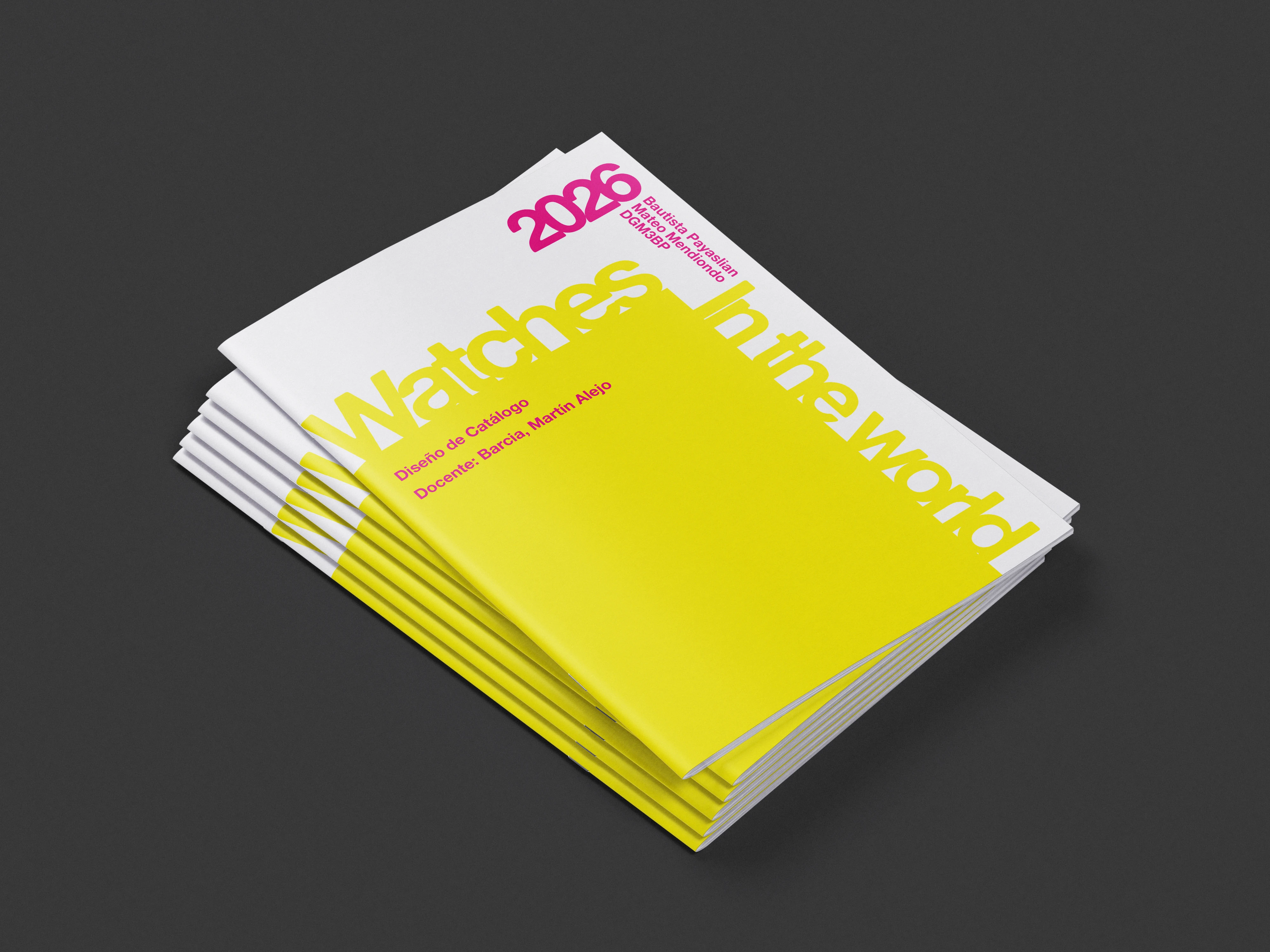
Watches in the World
Watch catalogue · Cátedra Barcia · 2026
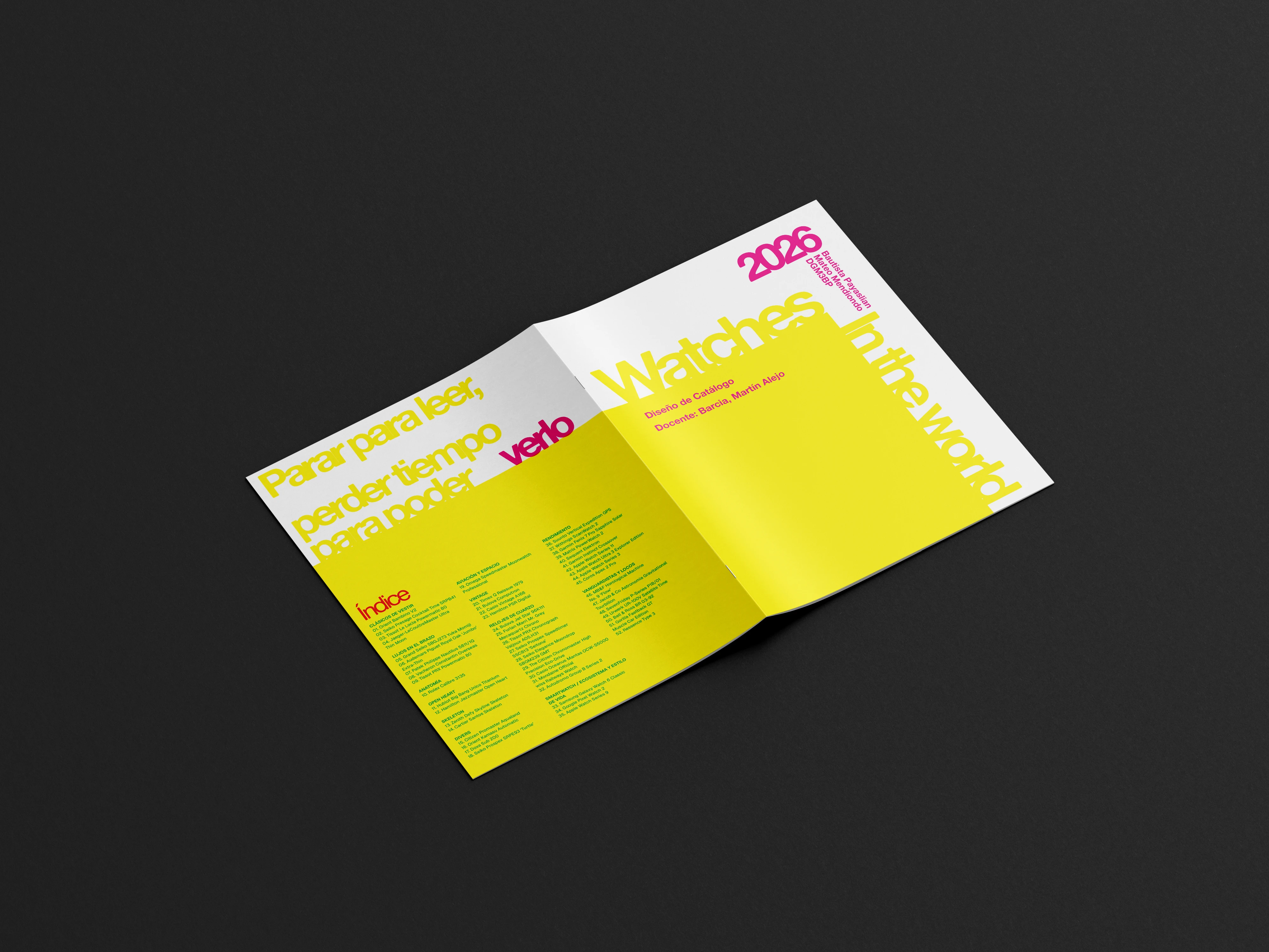
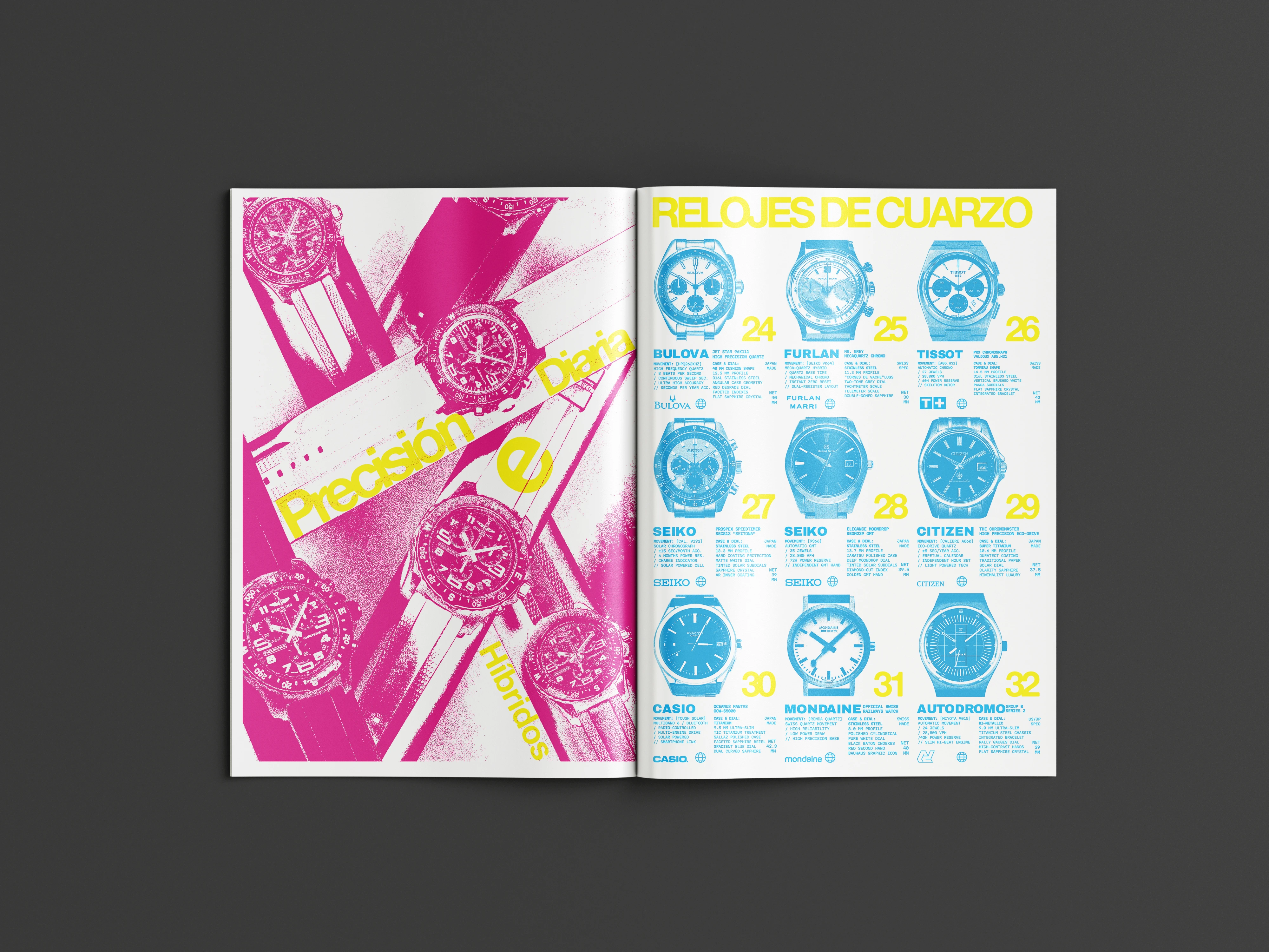
The project starts from an irony. You buy a watch to see the time, so a watch catalogue is really selling a way of seeing it. Watches in the World inverts that transaction: to be able to see the watches you have to spend time.
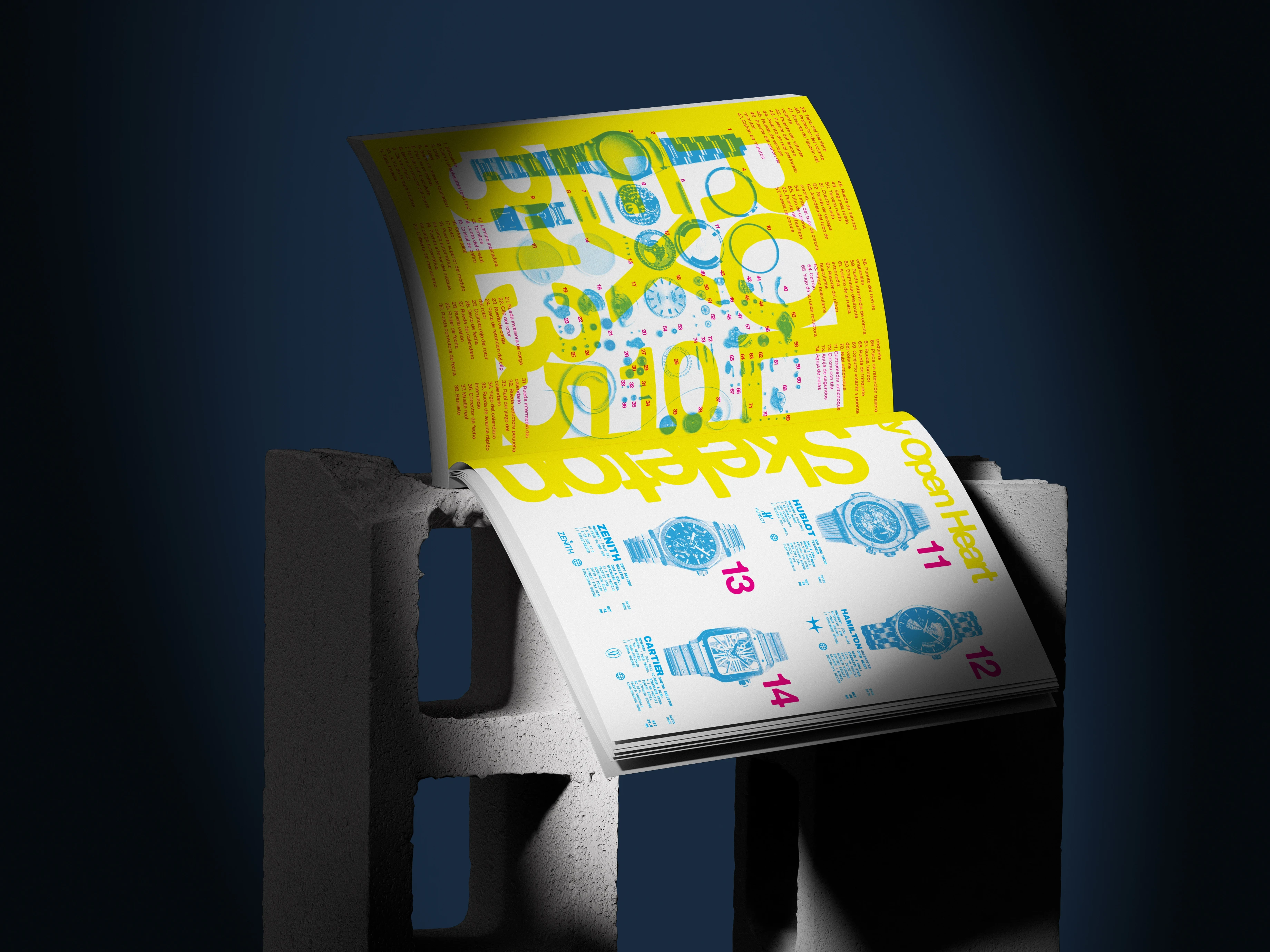
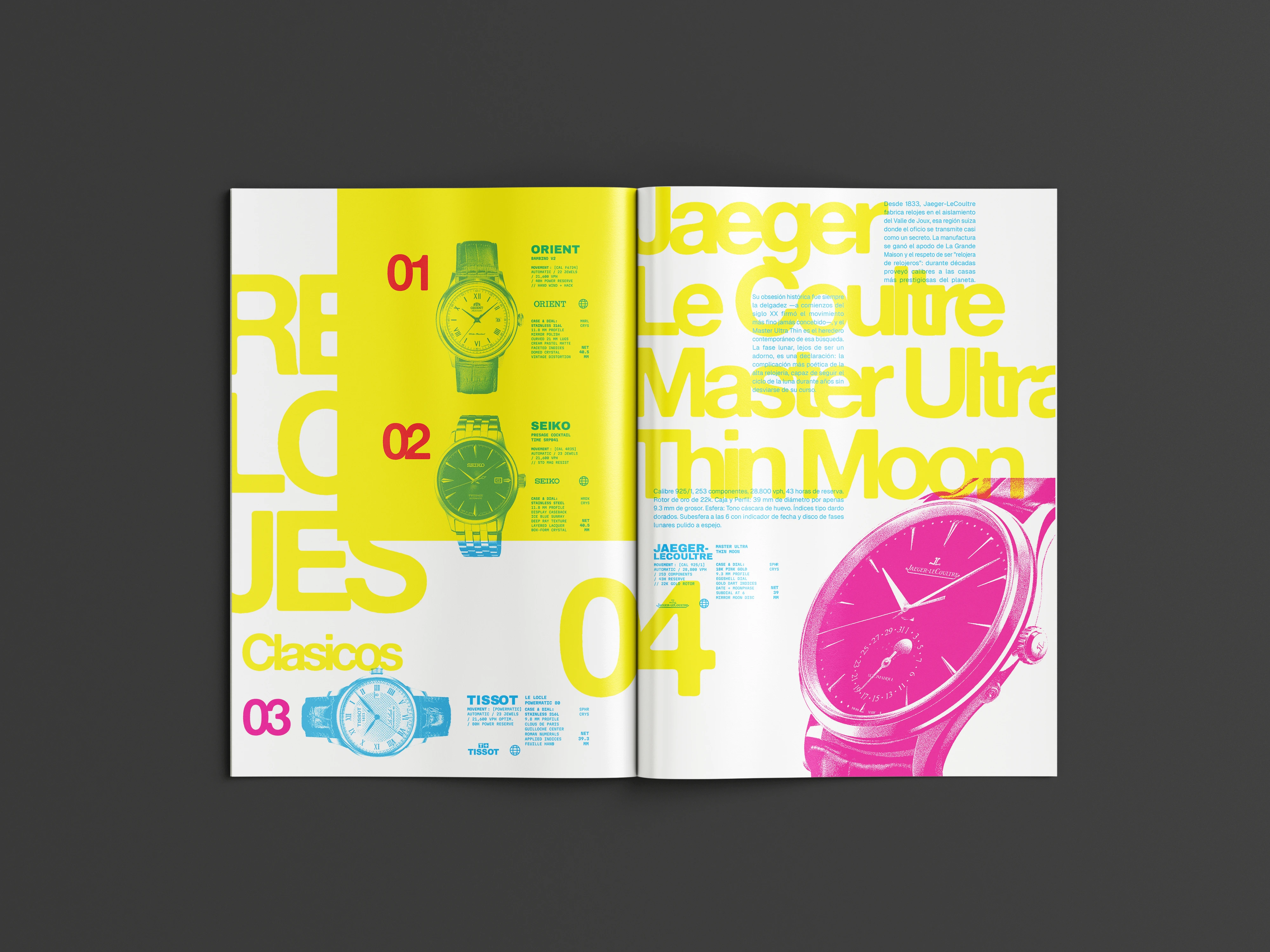
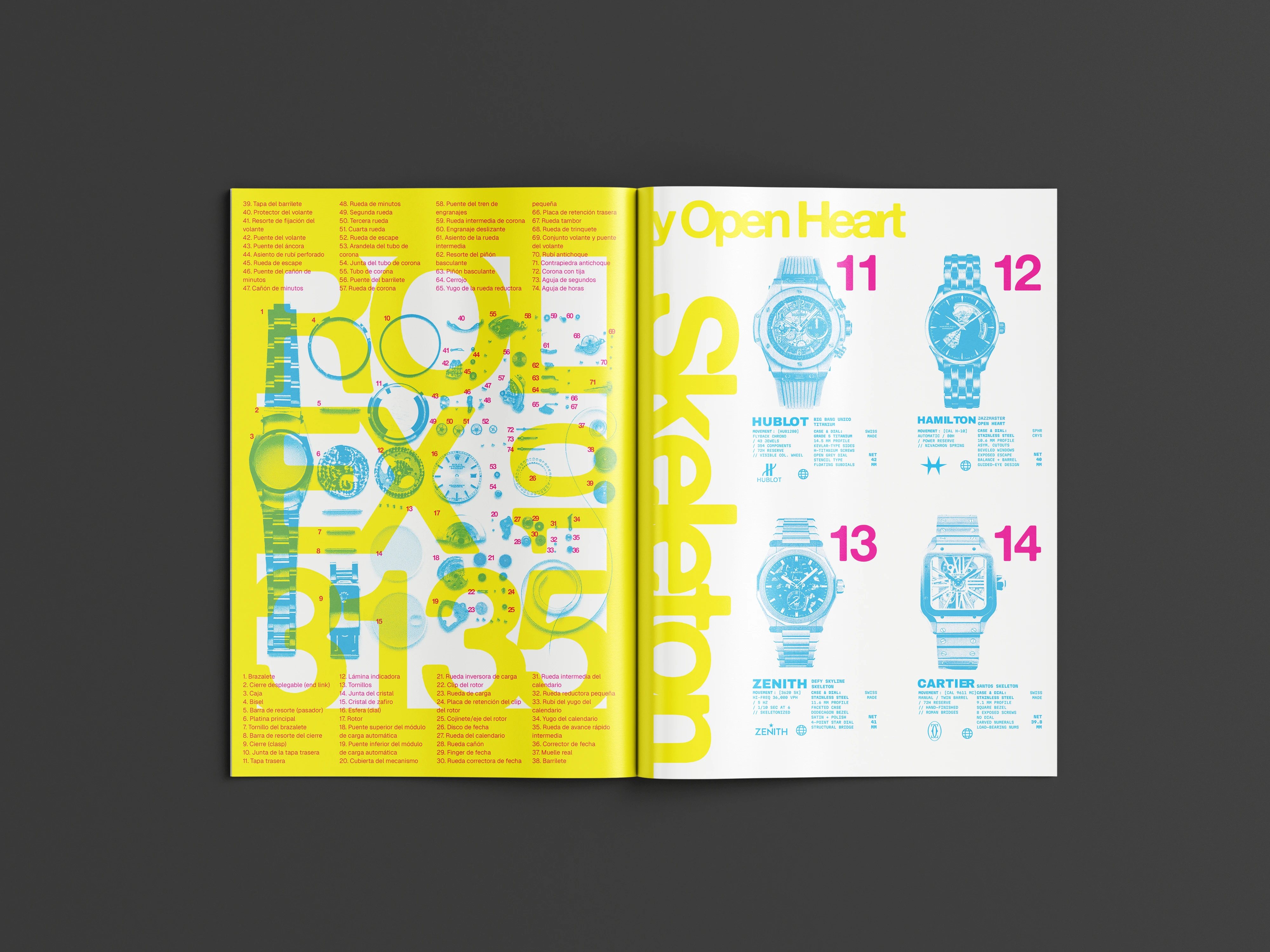
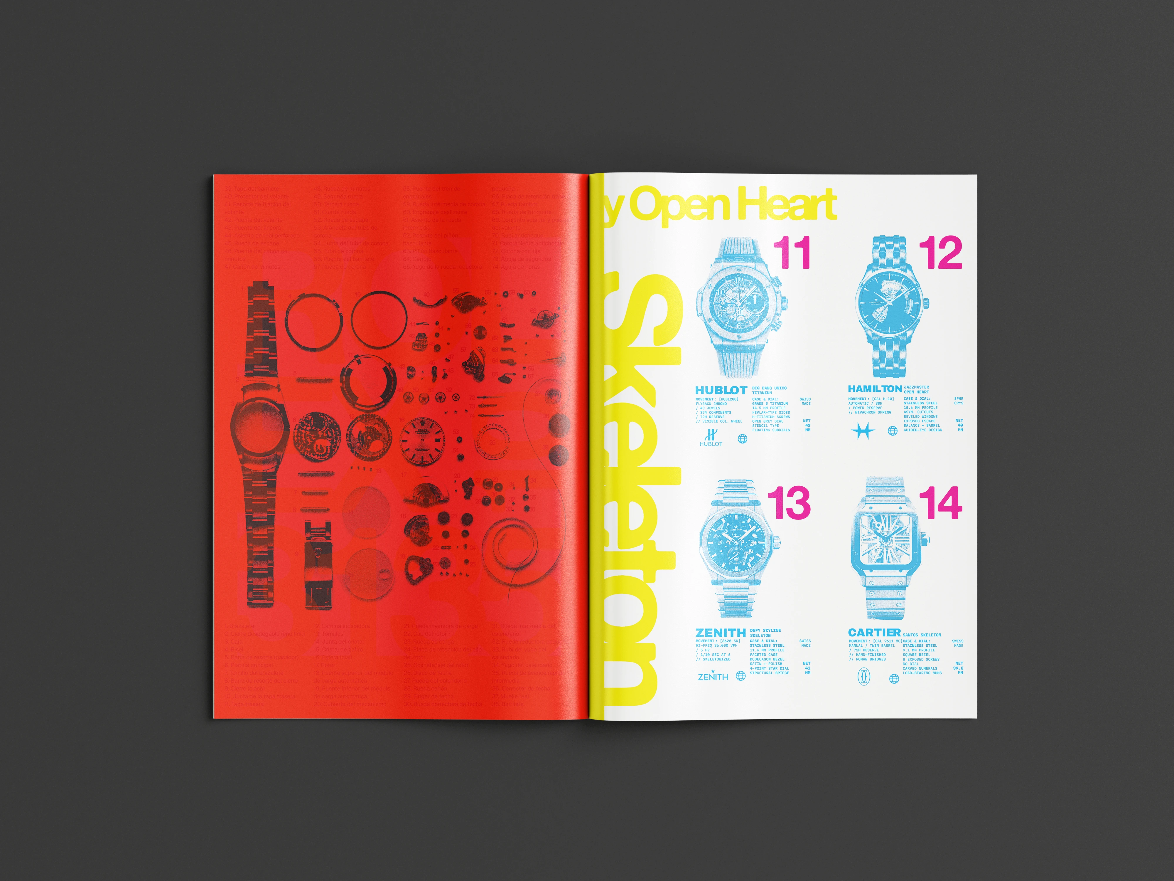
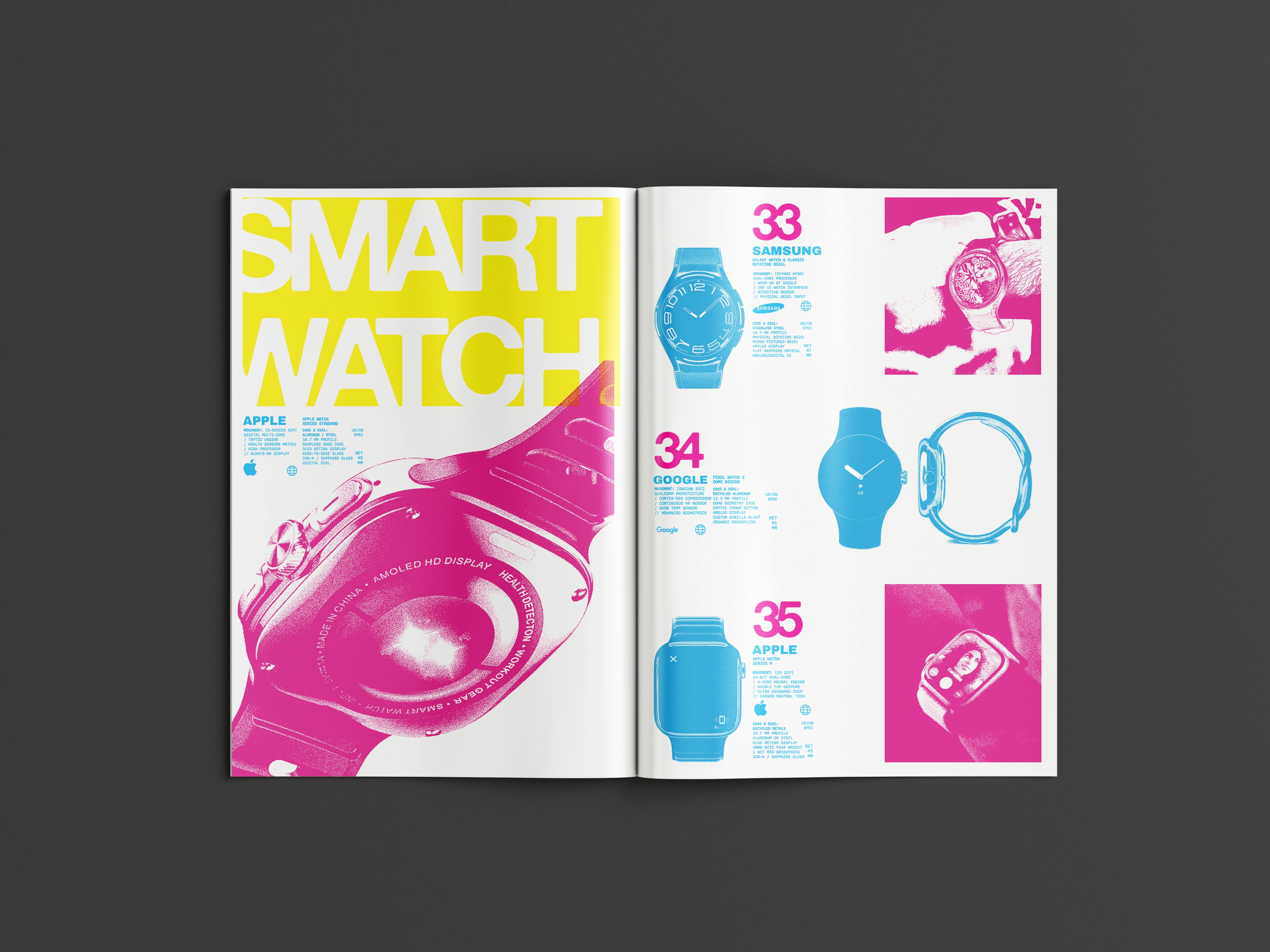
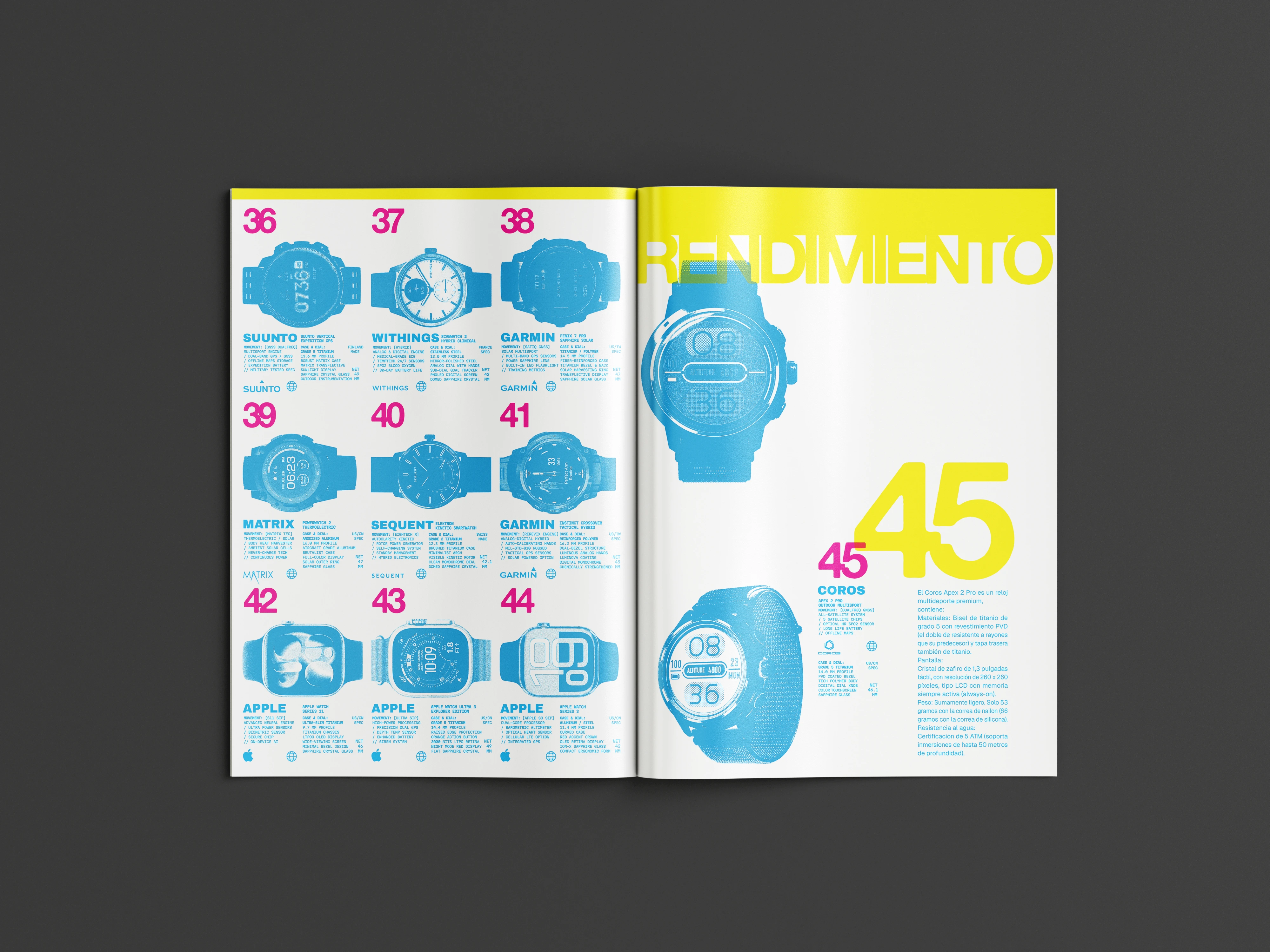
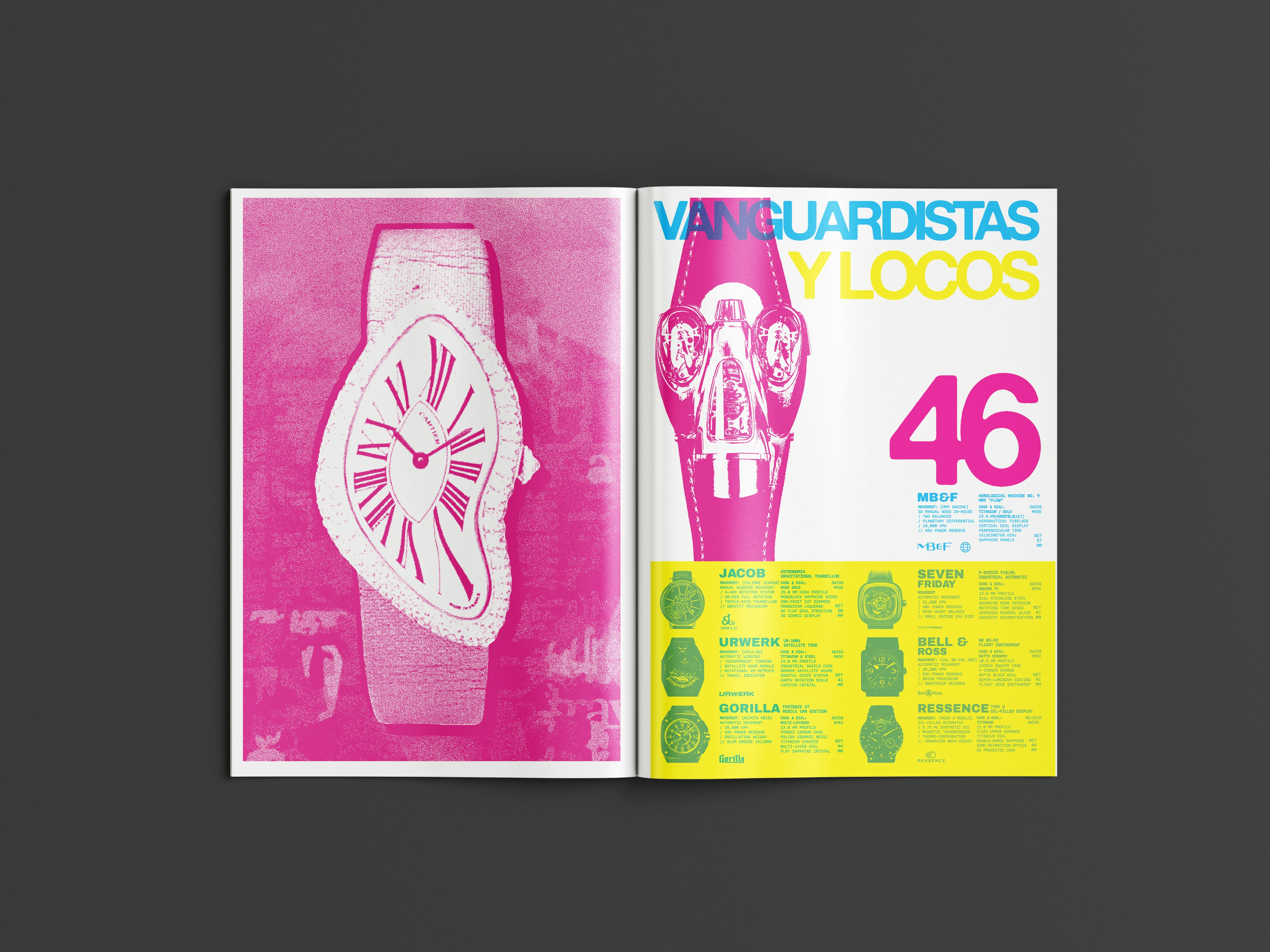
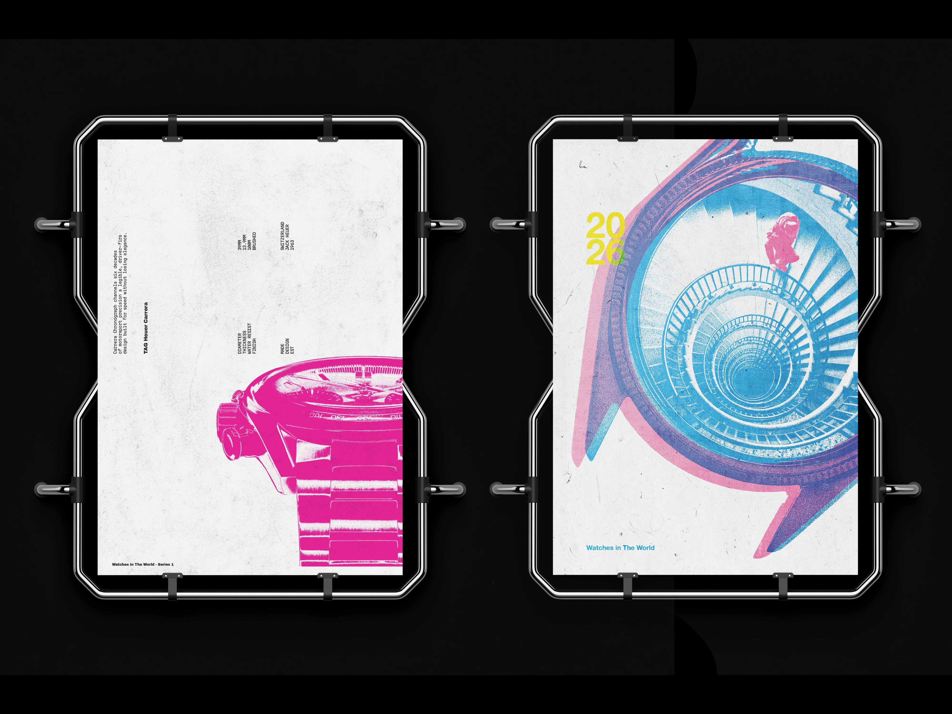
The mechanism is overprint. Over a base of cyan, magenta and yellow, a red acetate filters the page and leaves visible only what was in cyan. The acetate is not a loose accessory: it is bound in as one more page, so turning it is what applies the filter. Without it, the spread is dense and overlapped on purpose. With it, it is reduced to the watches.
That is why the layer assignment and the information hierarchy end up being the same decision. Under the red filter the cyan darkens and survives, while the magenta and the yellow blanch out against the paper. Whatever always has to be read goes in cyan, whatever can be lost goes in yellow. The filter does not reveal hidden content: it takes content away.
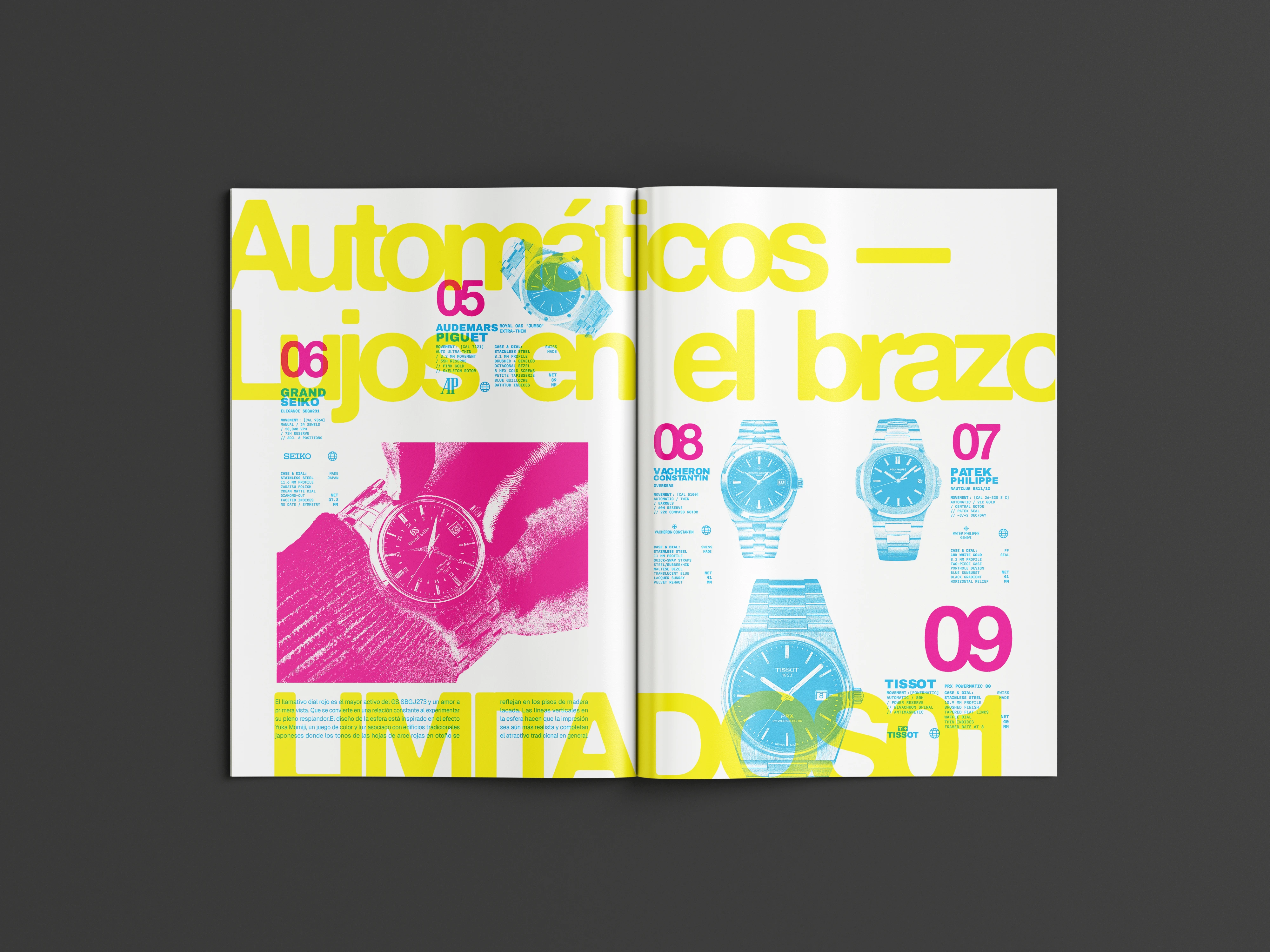
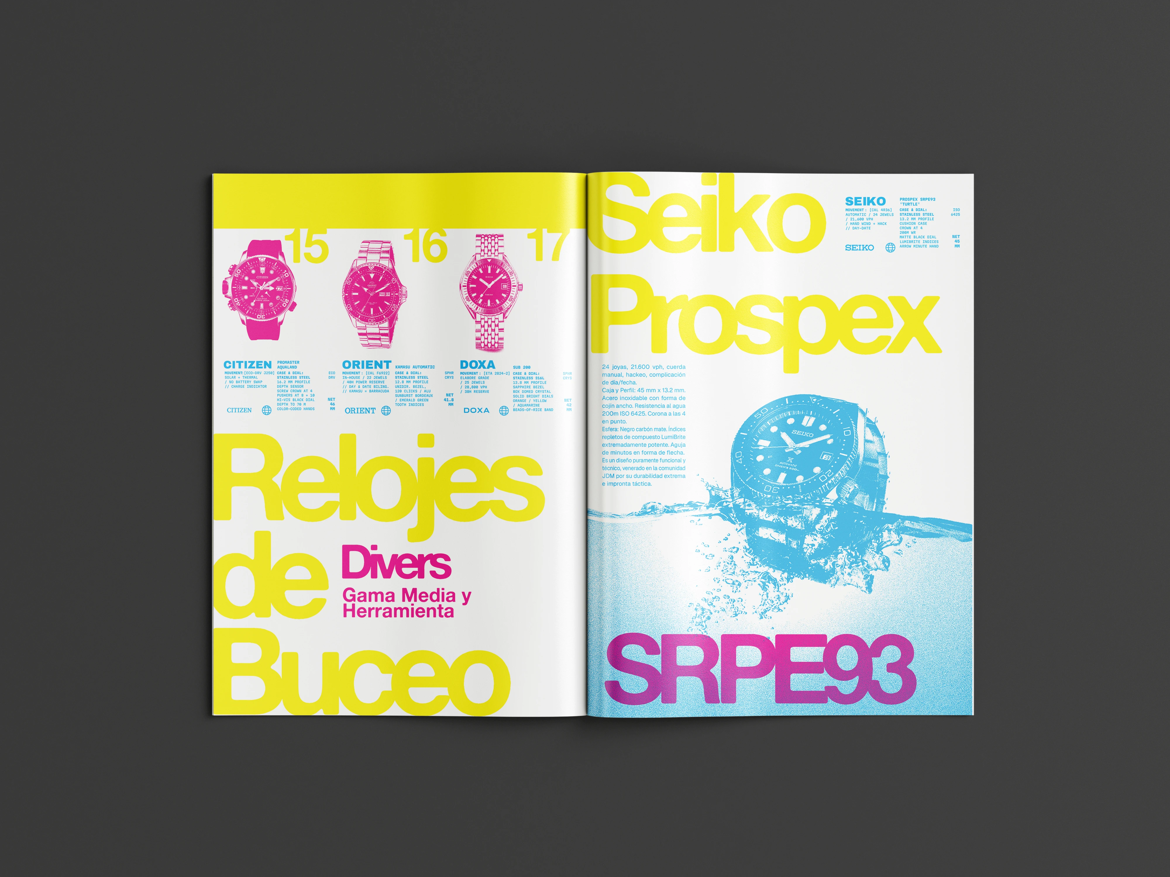
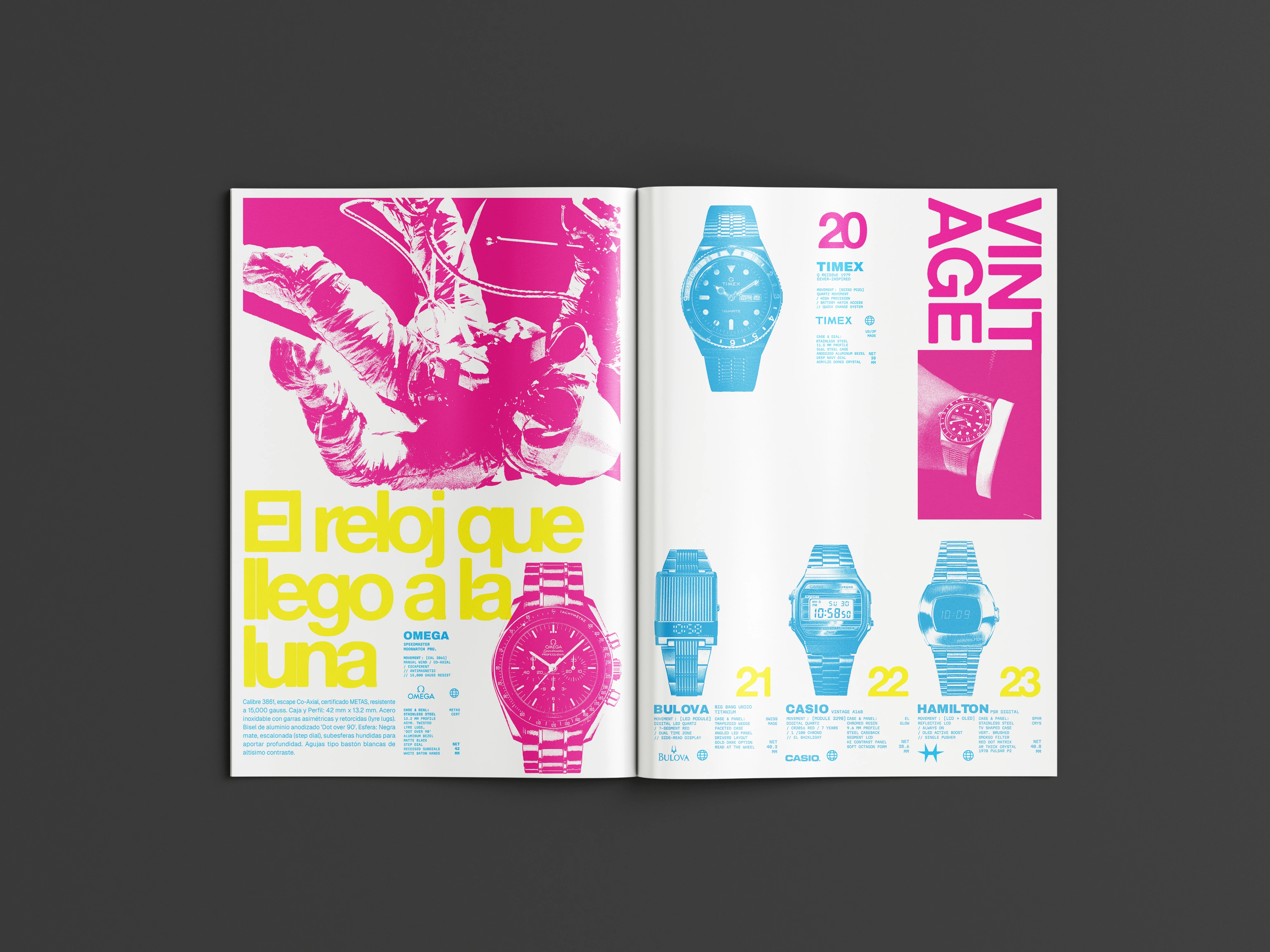
The images are press photographs from the brands, reduced to a single ink with noise, threshold and recoloring. The treatment is not an effect applied to the photo, it is the condition for the photo to enter the layer system at all.
It holds 52 watches across thirteen categories on 12 A4 pages in five spreads, in RGB because that is what makes the fluorescents possible. The density was the pair's choice, the brief did not ask for it. The back cover line comes out of that: the friction is not in looking through the filter but in everything before it, and that delay is what forces you to stop on each piece instead of leafing past it.
Three primaries on white, in RGB, which is what allows the fluorescents. They are not a palette in the usual sense: they are the layers of the technique. Assigning an element to a color is the same act as giving it its place in the hierarchy.
- Titles and blocksYellow#E8E028
- Numbers and highlightsMagenta#E837A0
- EssentialCyan#61BFE0
Katzen Haus
Bar and restaurant in Villa Devoto · Real client · 2025 / 2026
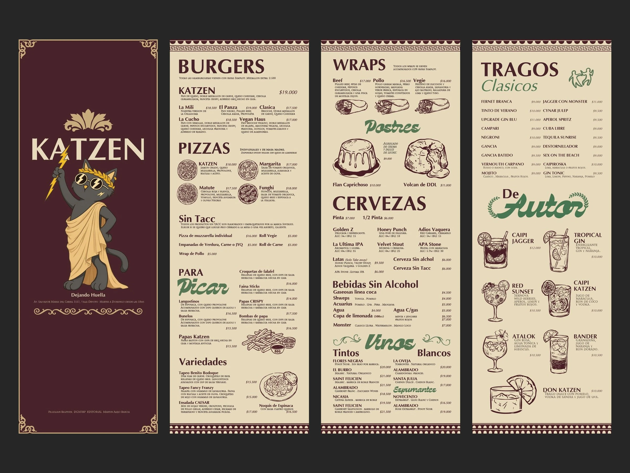
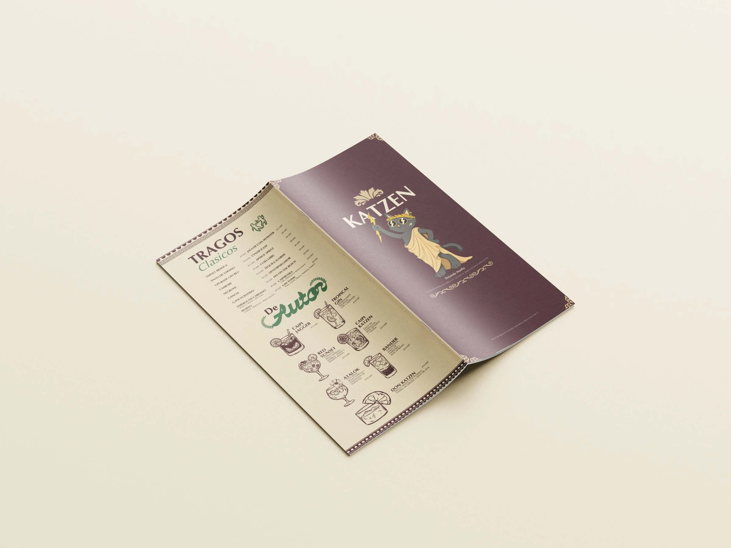
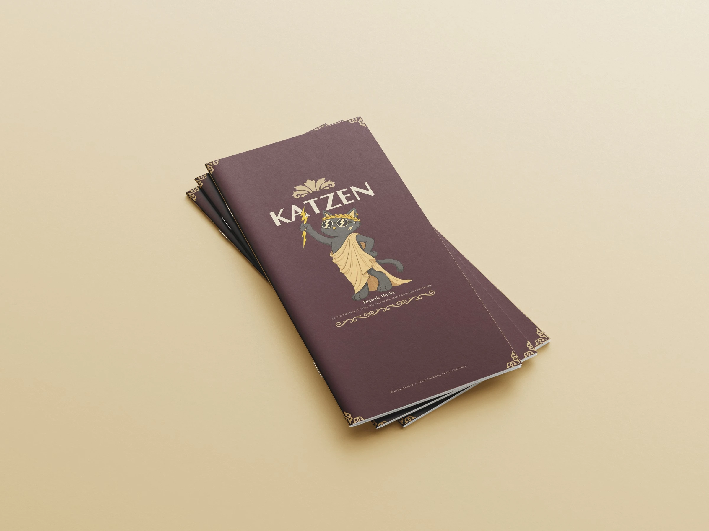
Katzen Haus is a bar in Villa Devoto with a cartoon cat as its character and a menu built for a young crowd. The job was to lift its register without losing the character, and the axis chosen to do it was Roman.
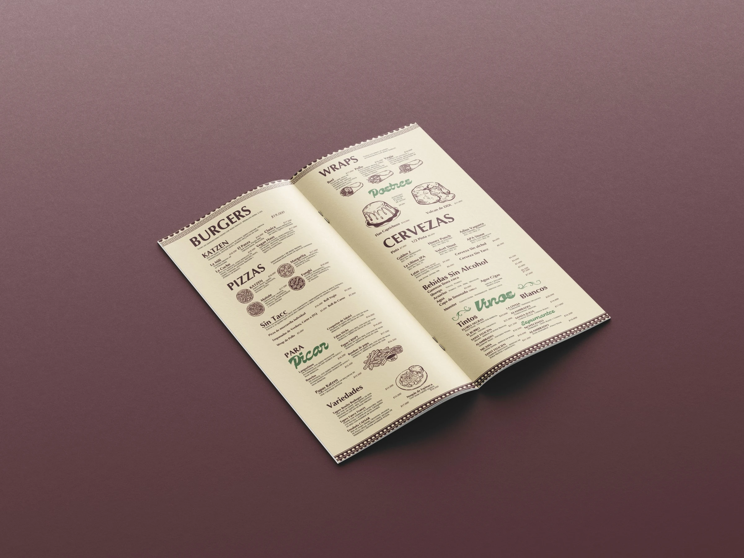
The structure came out of the Edict of Diocletian, the Roman edict of maximum prices from the year 301, carved in stone in columns of item and value. A bar menu is exactly that, so the hierarchy was not invented: it was taken from something that already solved the same problem.
The decorative vocabulary comes from Roman murals, which is also where the parchment and the wine red come from, and from the grottesche that Art Nouveau brought back centuries later. That is why Art Nouveau is not a jump between periods here, it is the road that vocabulary travelled to reach the present.
The cat stays but changes register: toga, laurel crown and lightning bolt. That is what allows the menu to move upmarket without the bar losing itself in it. The cover inverts the scheme of the interior and goes wine red with the illustration in gold.
The parchment and the wine red swap places between the cover and the interiors. The green appears only on the section headings and the gold only on the illustration.
- Interior backgroundParchment#E7D9BC
- Ink and cover backgroundWine red#48232A
- Section headingsGreen#497652
- Illustration and ornamentGold#C8AC7C
Vogue x F1
12 page magazine · Editorial Digital · 2025
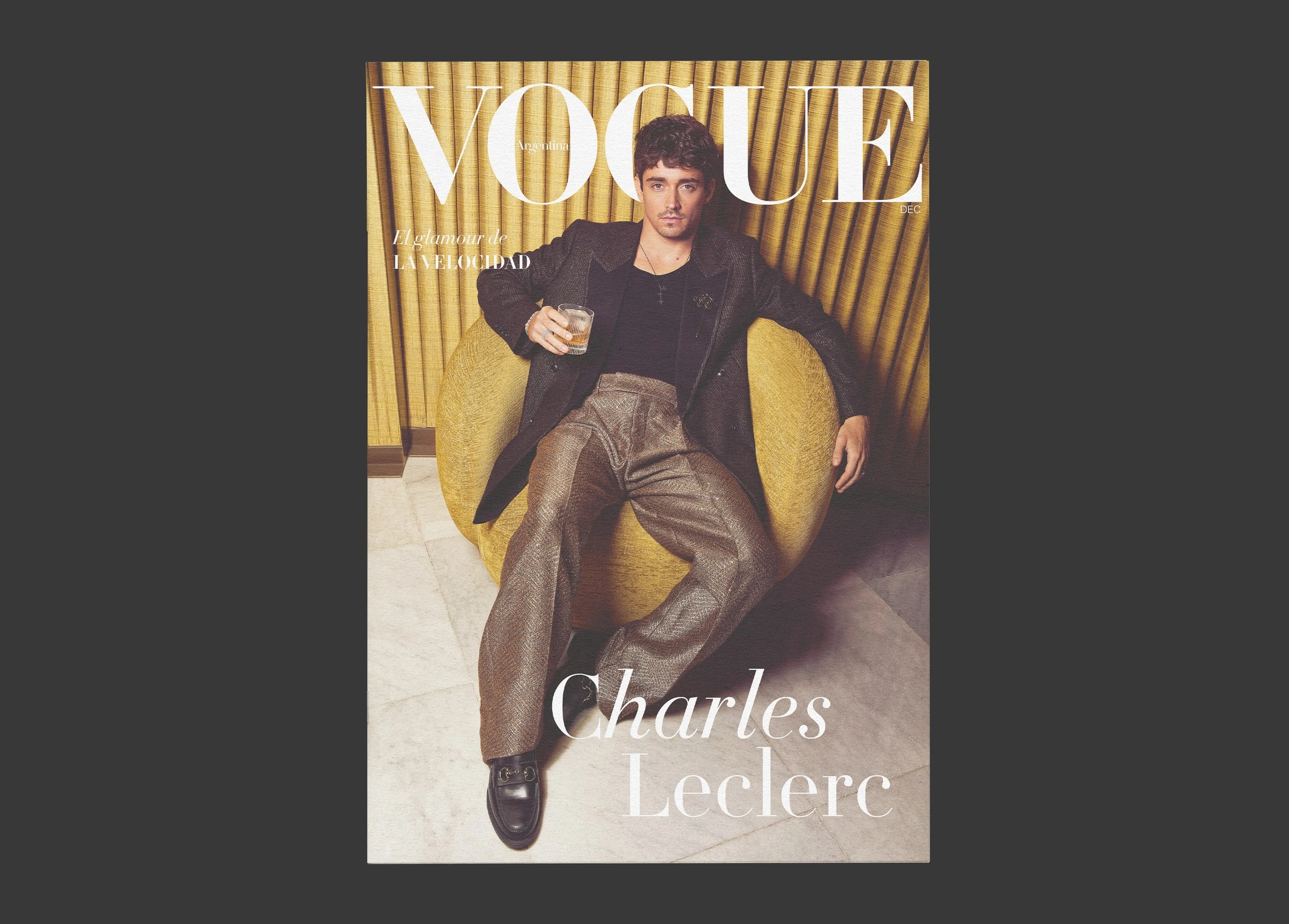
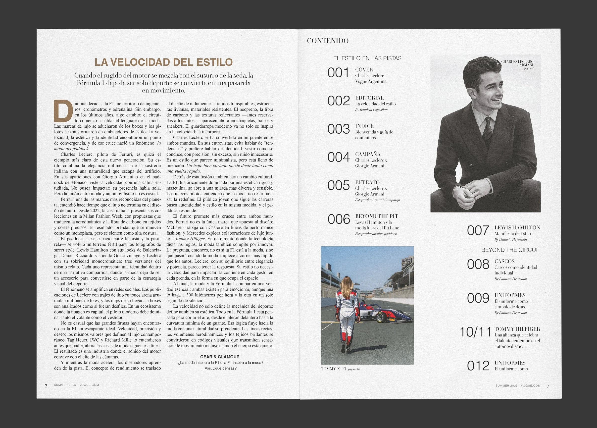
The brief asked for a twelve page magazine at 20 x 28 cm using a real printed publication as a reference, on any subject. The work was not to invent a style: it was to decode one.
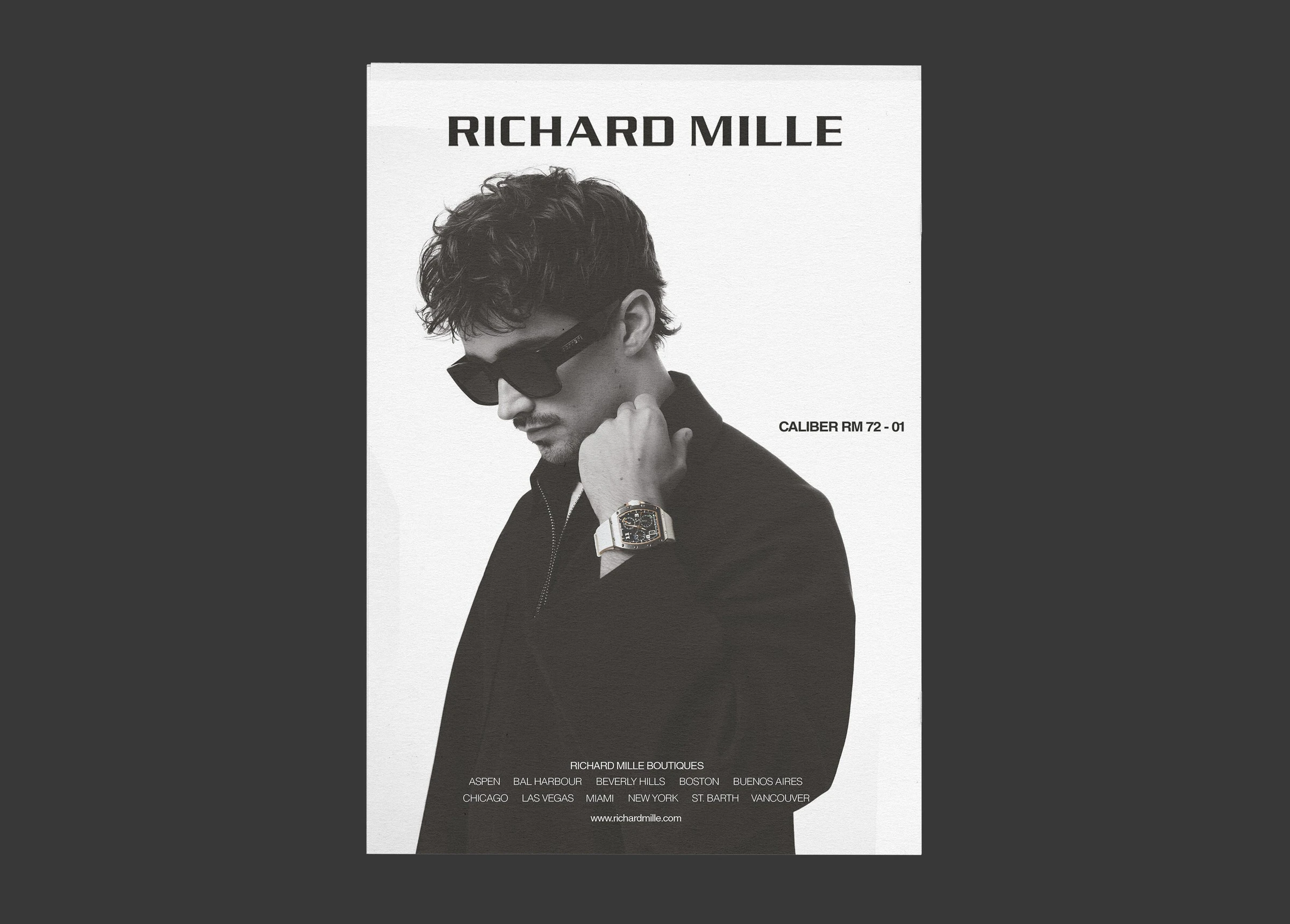
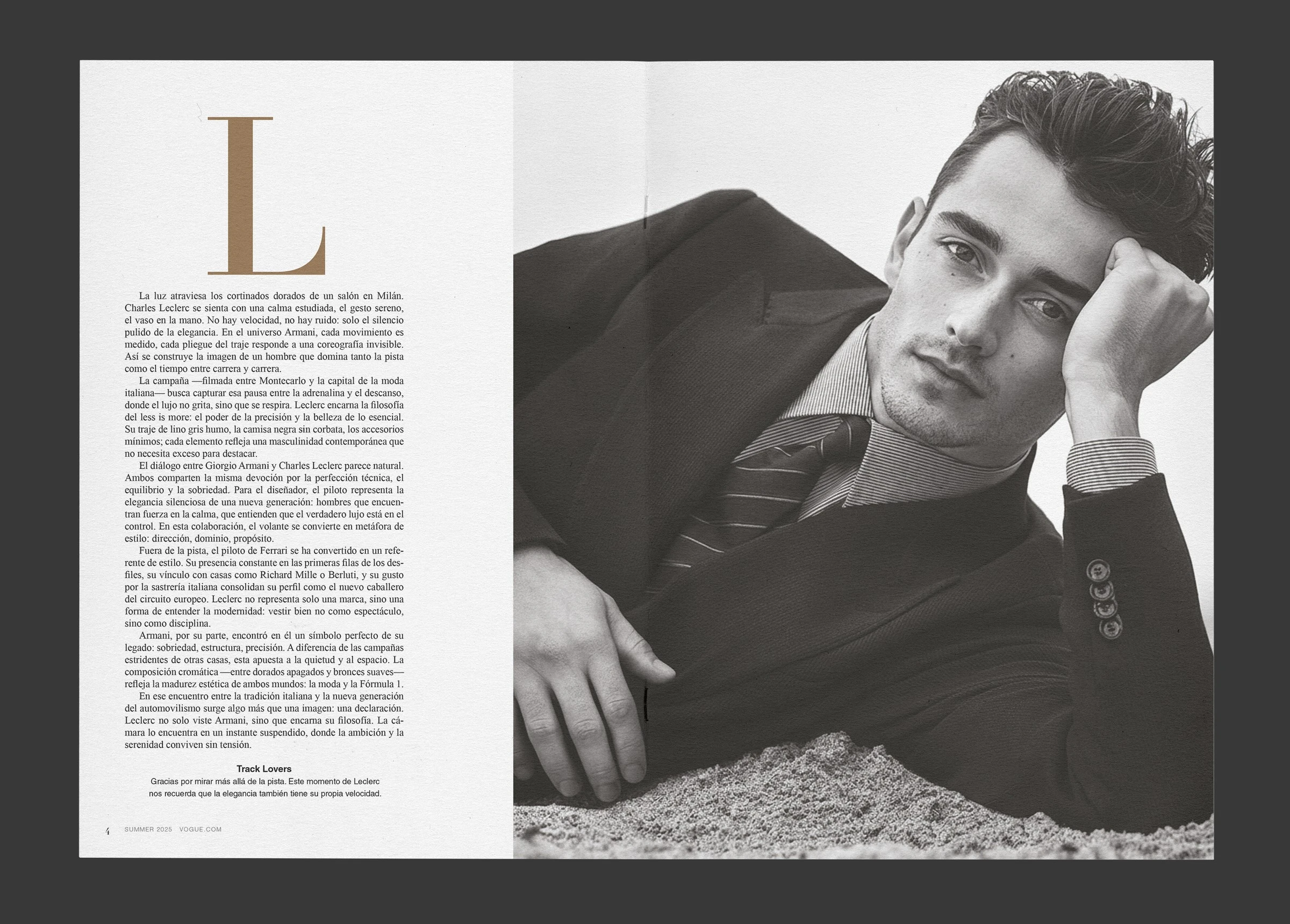
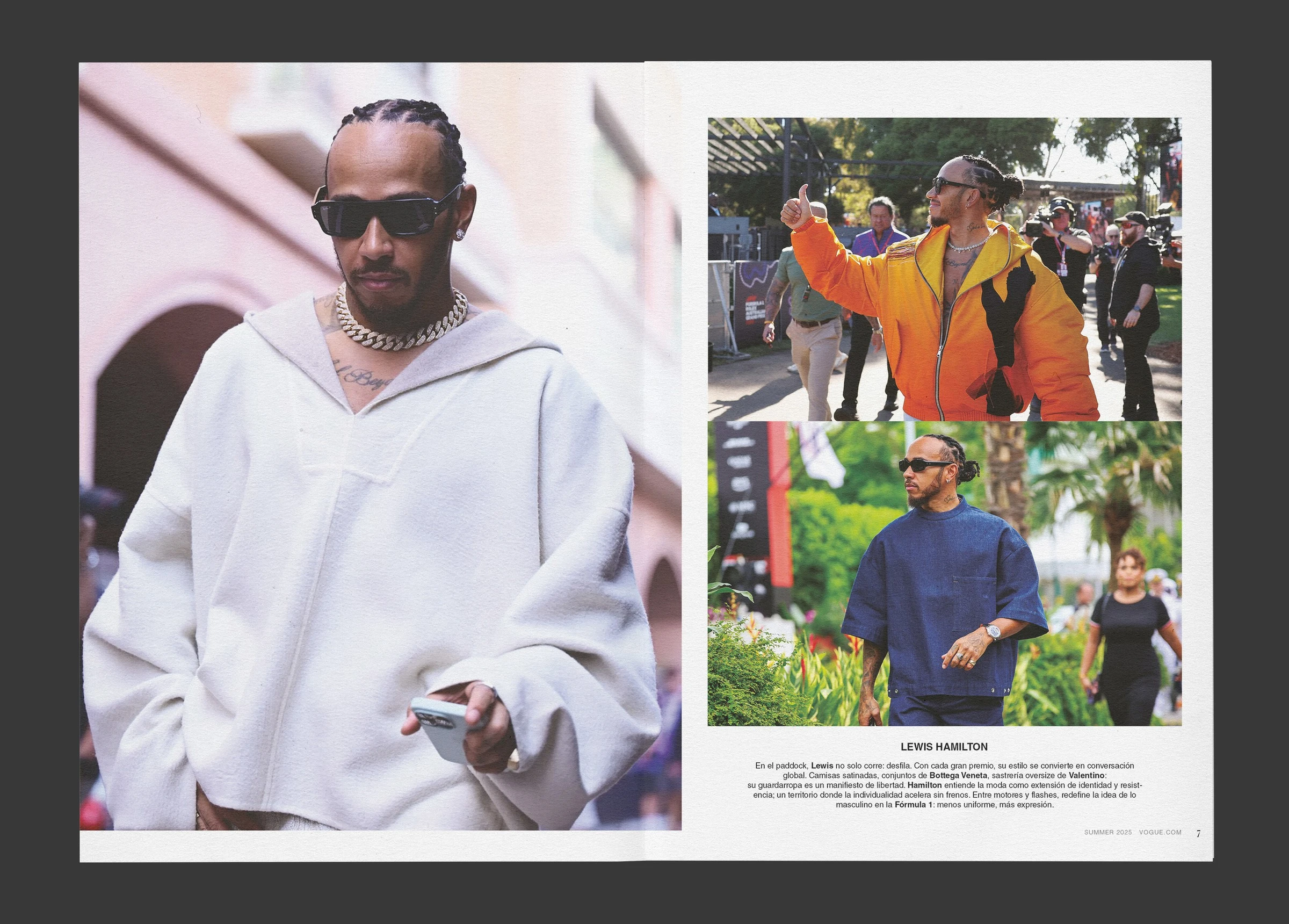
There was no guideline. To be able to lay out like Vogue you first had to read a lot of issues of Vogue as a system and work out the rules they follow: margins, families, weights, leading, how headlines behave against the text block, when a photograph bleeds and when it respects the grid. Only once those rules were written down could new content be written inside them.
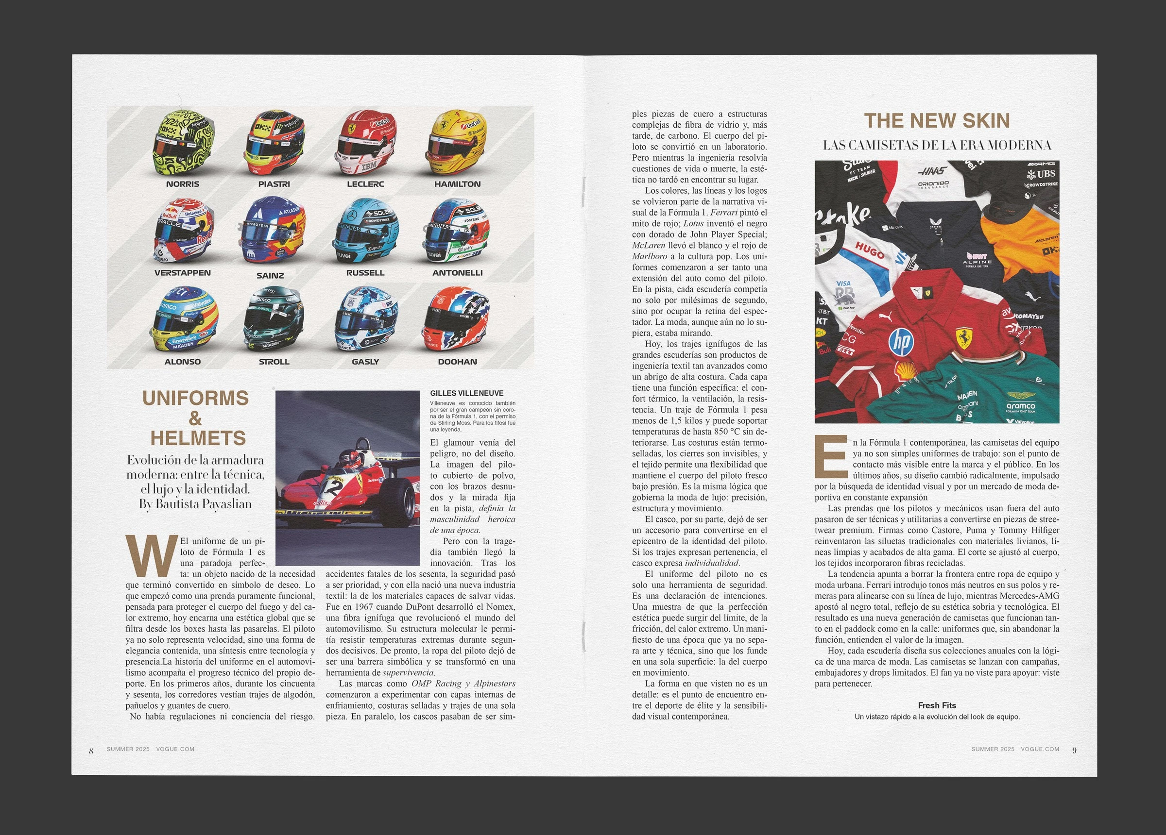
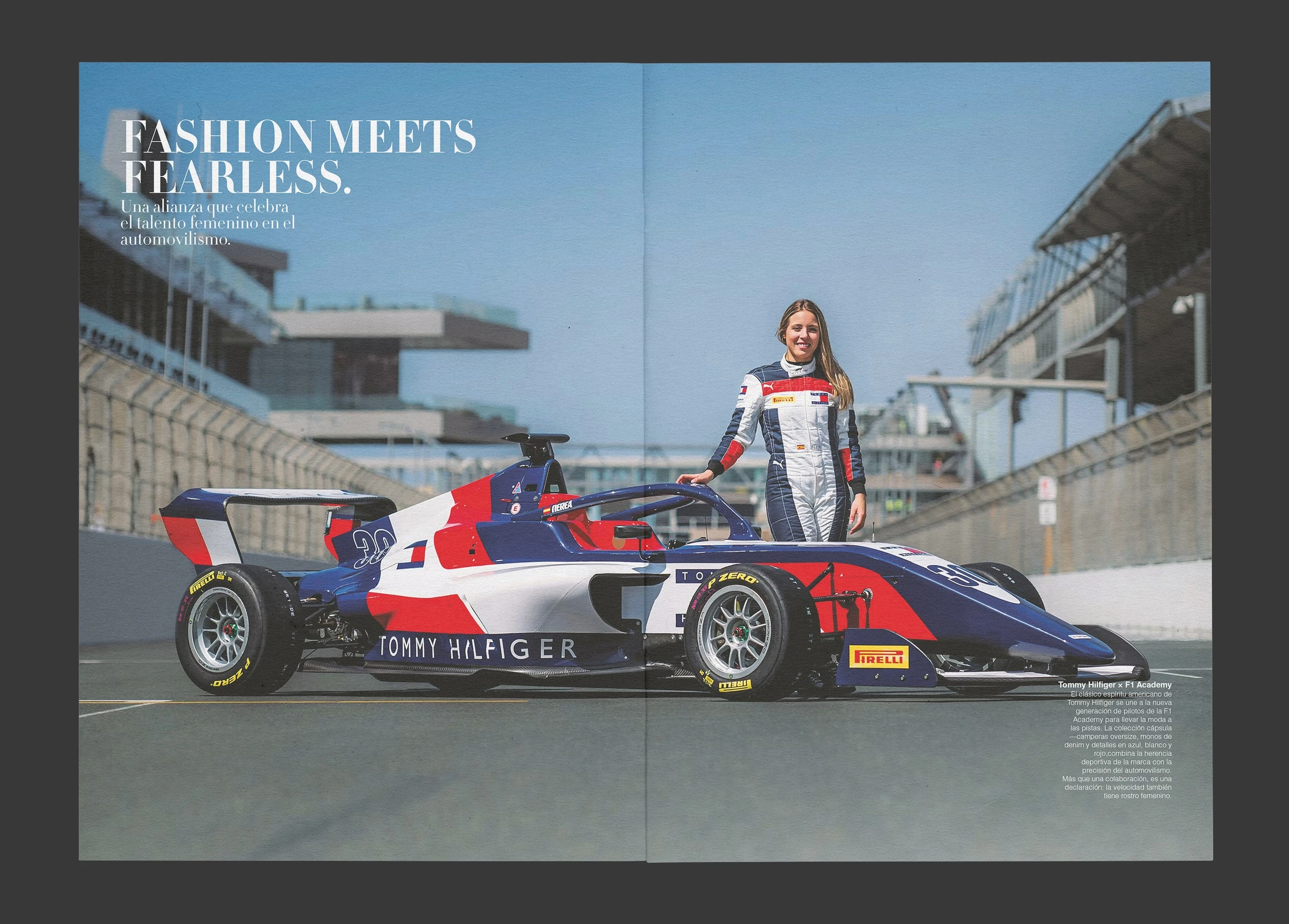
The subject chosen was Formula 1 seen through fashion. It is a contrast that serves the exercise: a technical sport told with the vocabulary of a fashion magazine, where an engineering fact and a styling one share the same hierarchy. That is where the opening feature title comes from, La velocidad del estilo, and sections like Uniforms and Helmets, which treats helmets as garments.
The structure meets what the department asked for and is also what gives the piece its shape: two master pages with different grids, one per section, automatic folios, a baseline grid with the long features at 10 point on 12 point leading sitting on the line, and separate hierarchies for headlines, standfirsts, pull quotes and captions. It was submitted printed, with covers on 150 gram coated stock and interiors on 80 gram uncoated, trimmed and stapled as a magazine.
Next caseDvourBrand identity and system · 2025