Kizuna
Brand identity and visual system
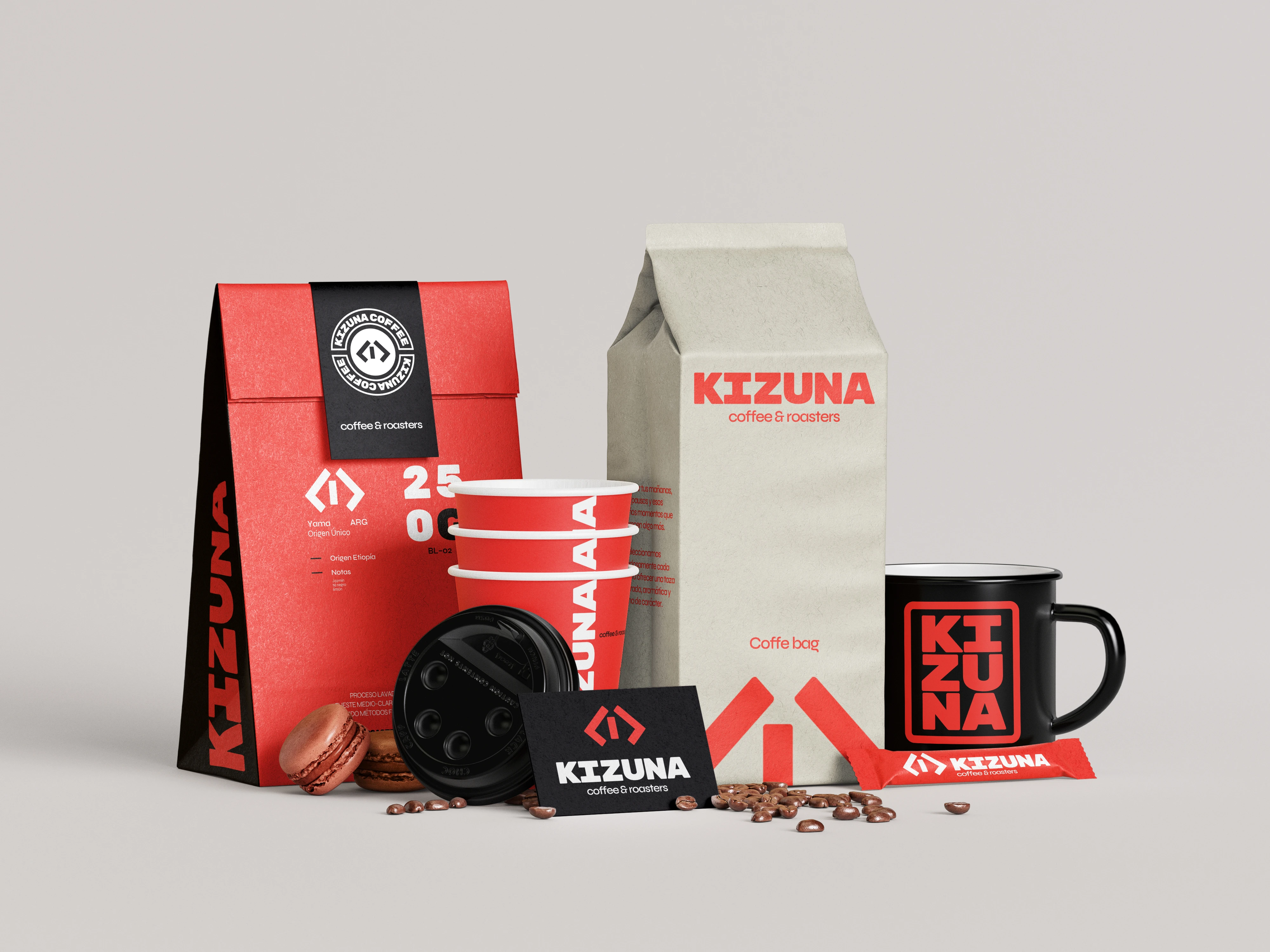
The Intersection of Urban Chaos and Precise Craft
Specialty coffee in Buenos Aires repeats one visual repertoire and, underneath it, a single idea: the cafe as a cozy place. Kizuna is built against that idea.
People who value disruption and go looking for excellence in coffee, and who cannot find a place that represents them among so many cute cafes. The crossing point of choice for everyone the rest has no room for. Instead of warmth, it offers recognition.
It does not offer a place to be comfortable in but a place you go to drink coffee, and instead of warmth it offers recognition. That is why the system is hard: the hardness is the signal.
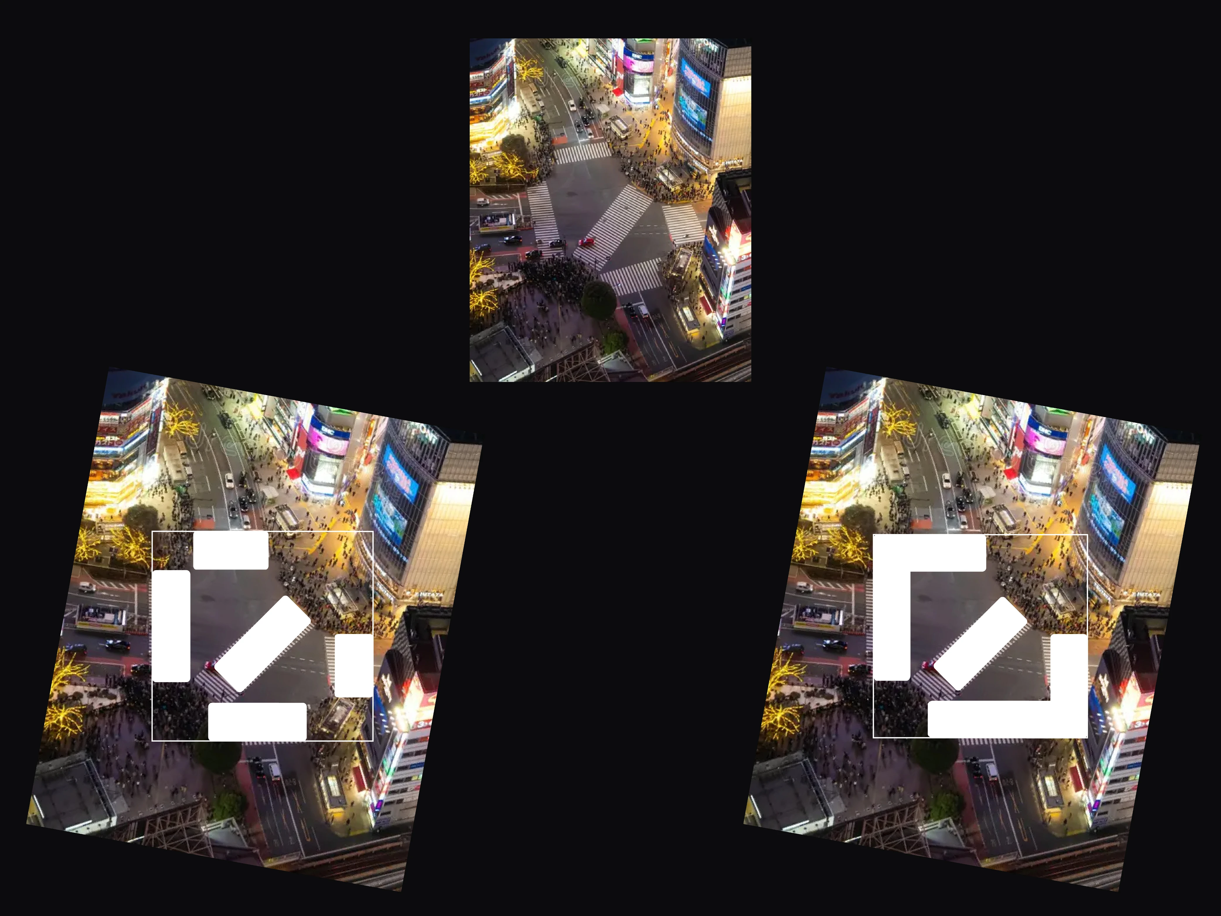
Kizuna (絆) means bond. The brand does not stand for the coffee but for the place where the people drinking it cross paths. The reference is the Shibuya Crossing, and what it contributes is its mechanics: thousands of trajectories pass through the same point without colliding. The disorder does not disappear, it gets a structure. Kizuna does not house a chaotic place, it houses chaos that organises itself, and that is why the system is high impact and strictly gridded at the same time.
The whole language comes out of the Japanese and Buenos Aires crossing, resolved with the almost Swiss brutalism in everyday use in Japan today. Fictional brand, self initiated project: the applications are shown on mockups and nothing was physically produced.
A synthesis of the Shibuya Crossing
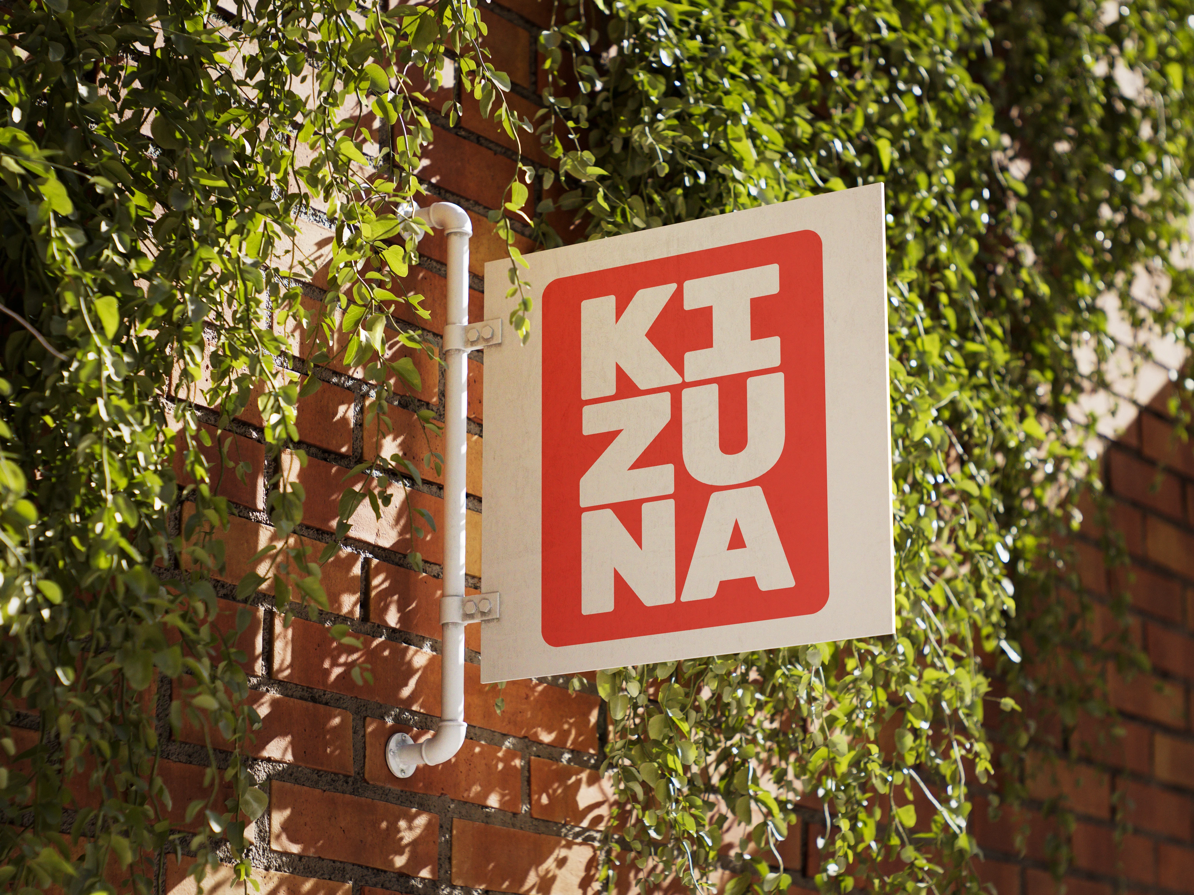
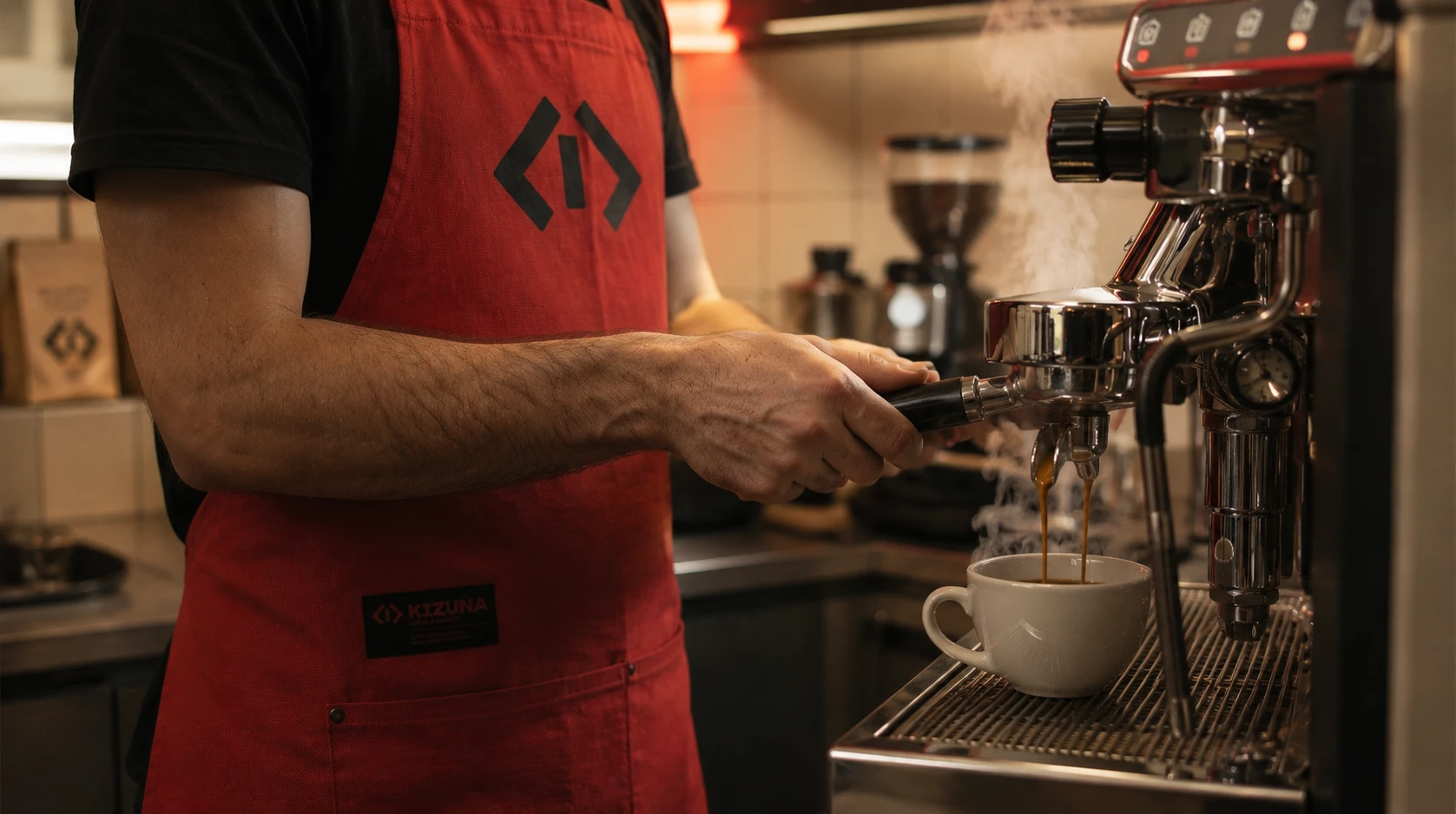
A geometric synthesis of the crossing lanes, built from primary shapes. It works as an urban eye and as a symbol of convergence at the same time.
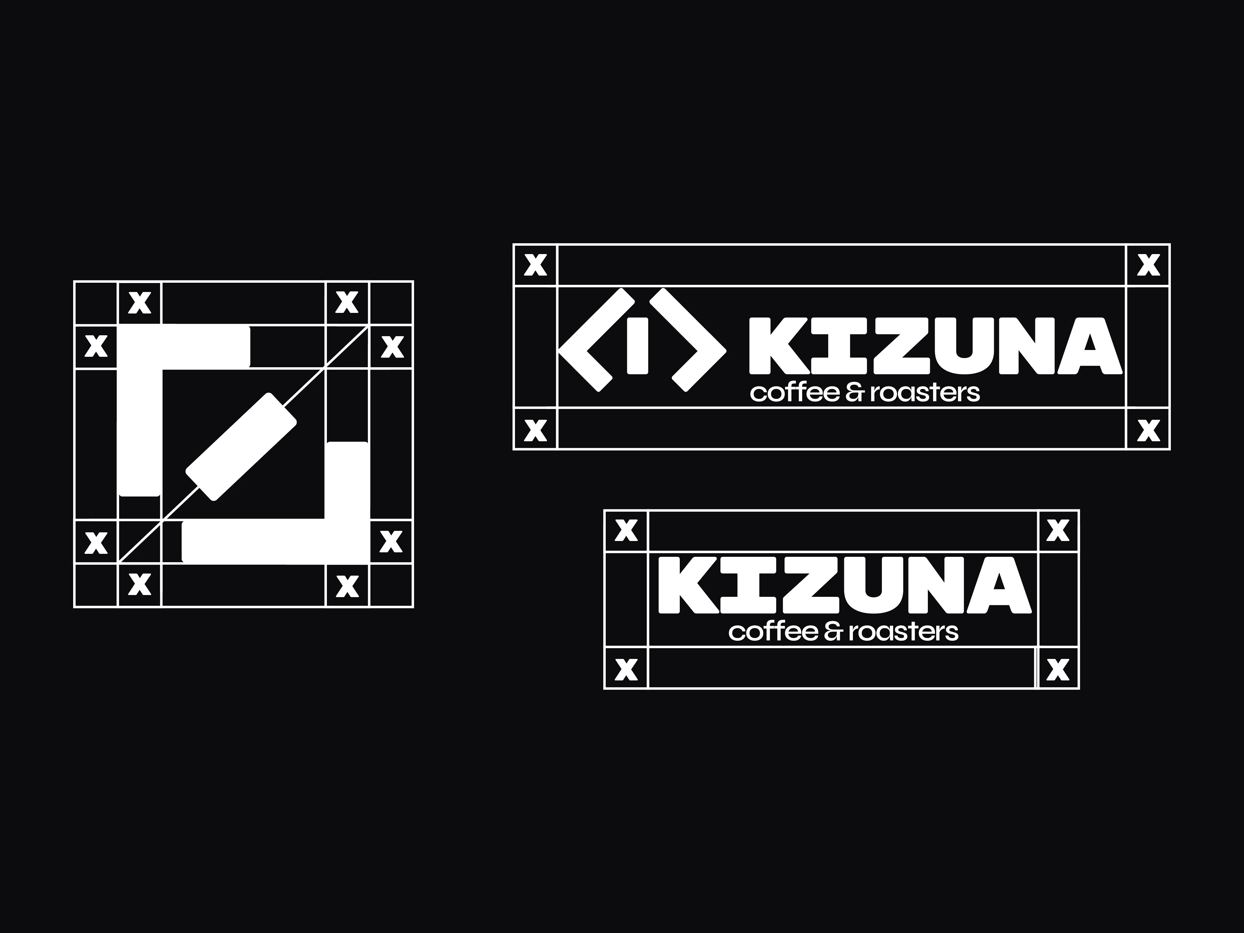
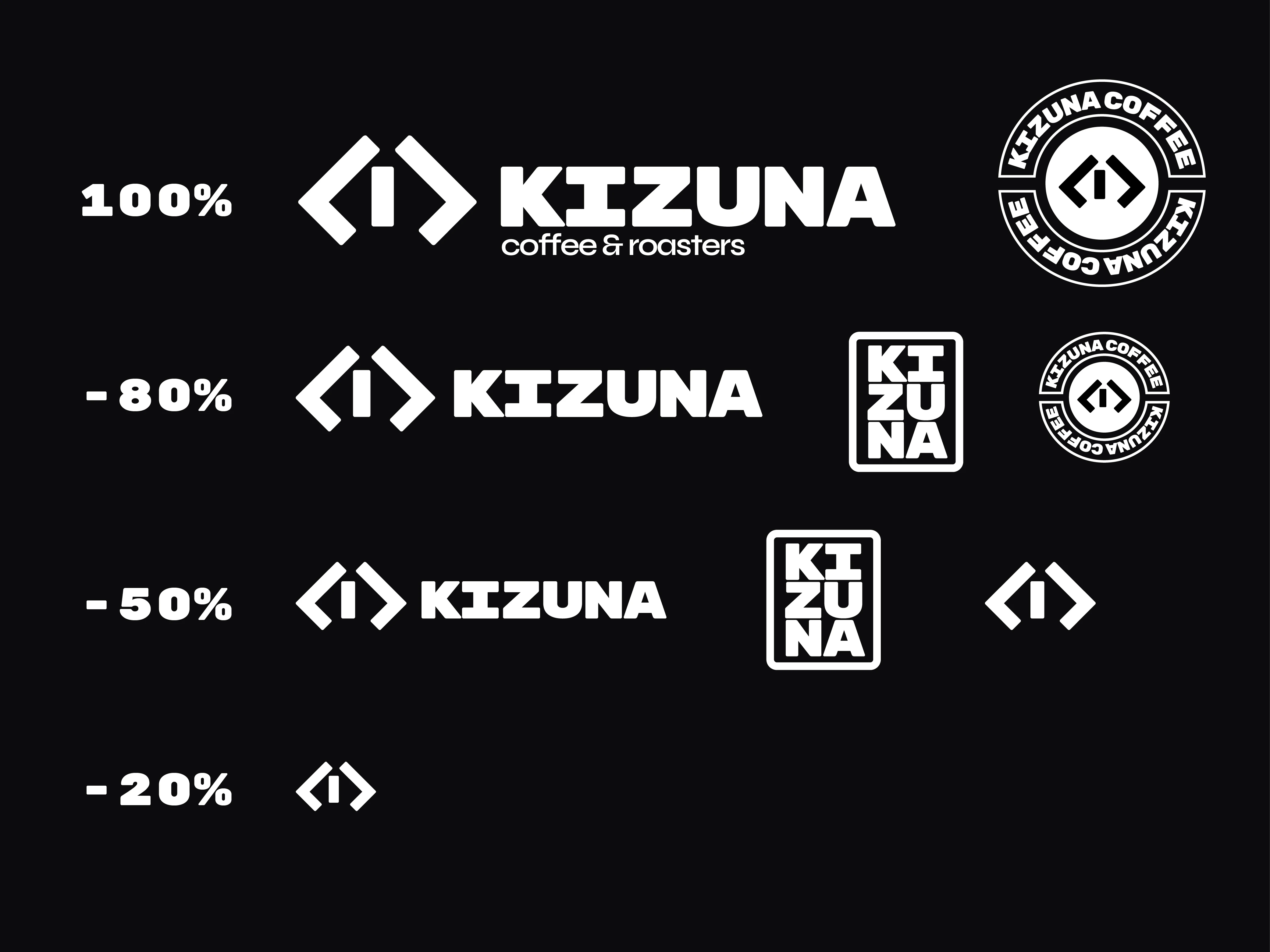
It was not drawn separately from the typography: it came out of the stem of the primary family. That is why the symbol and the wordmark close as a single piece.
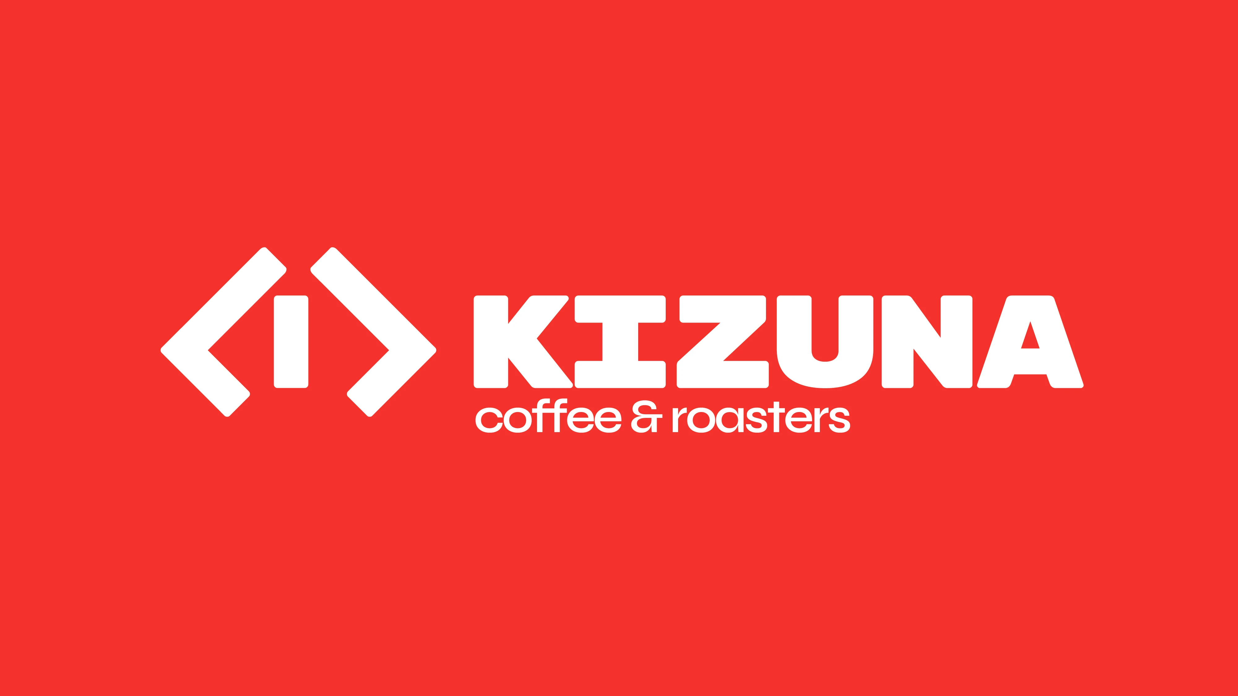
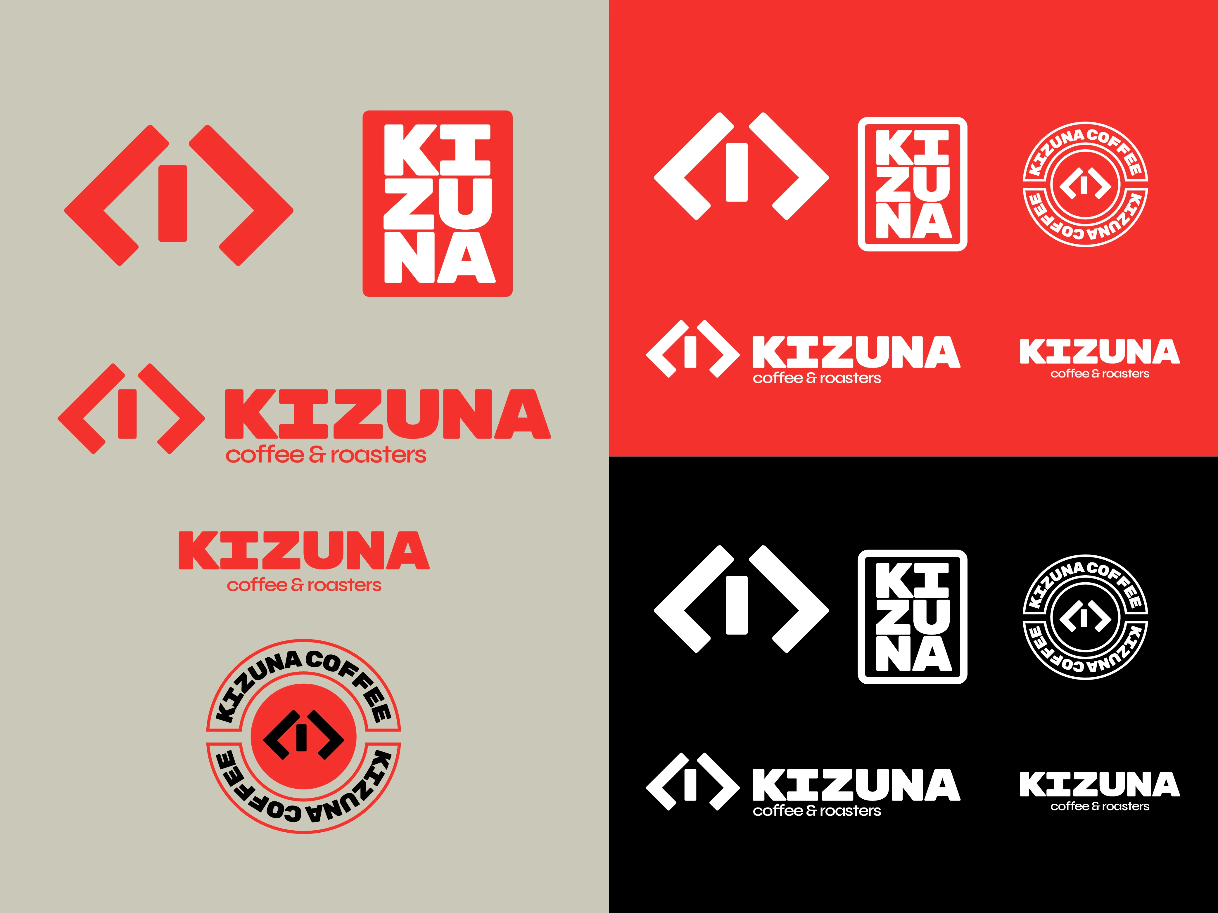
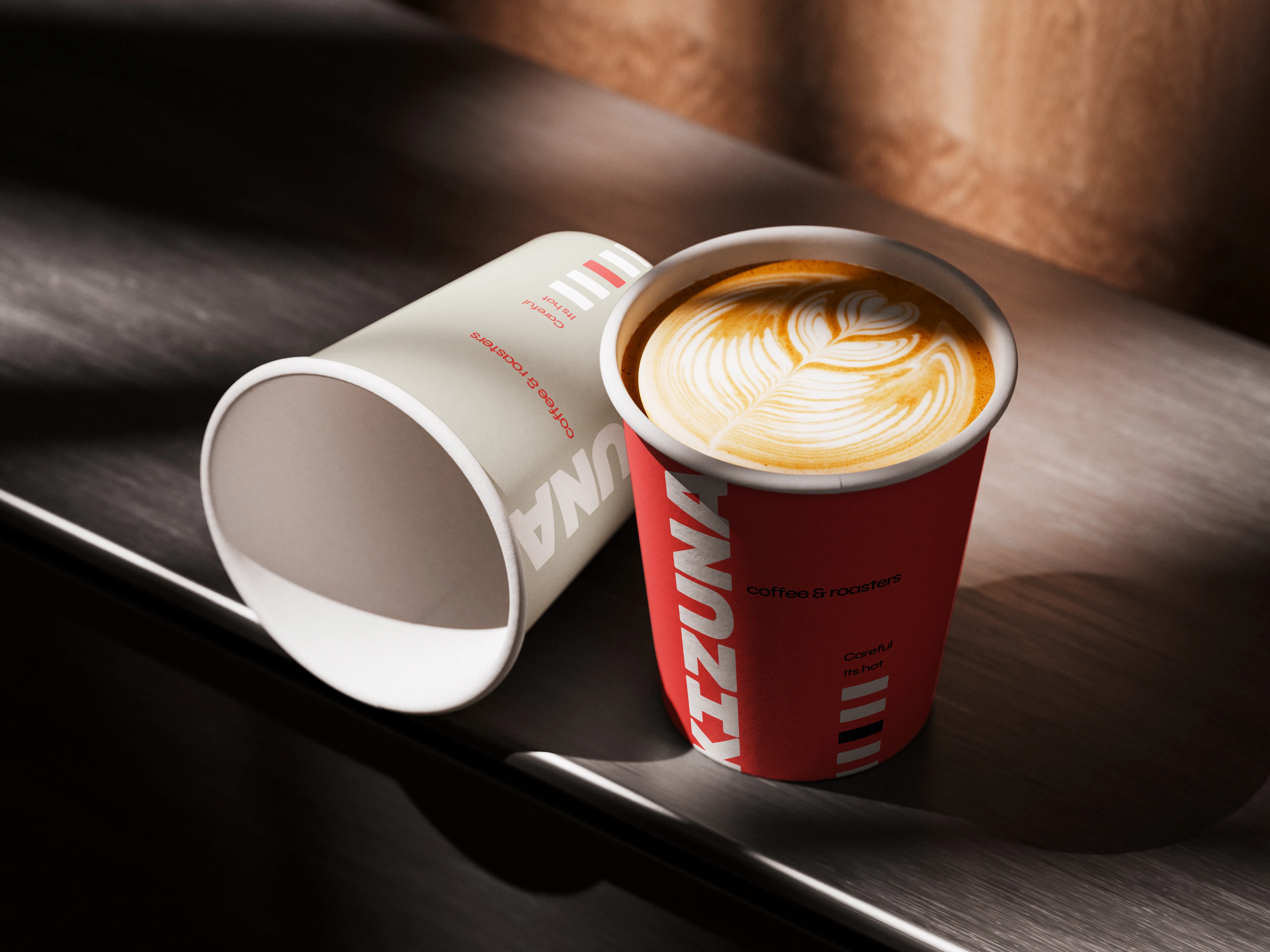
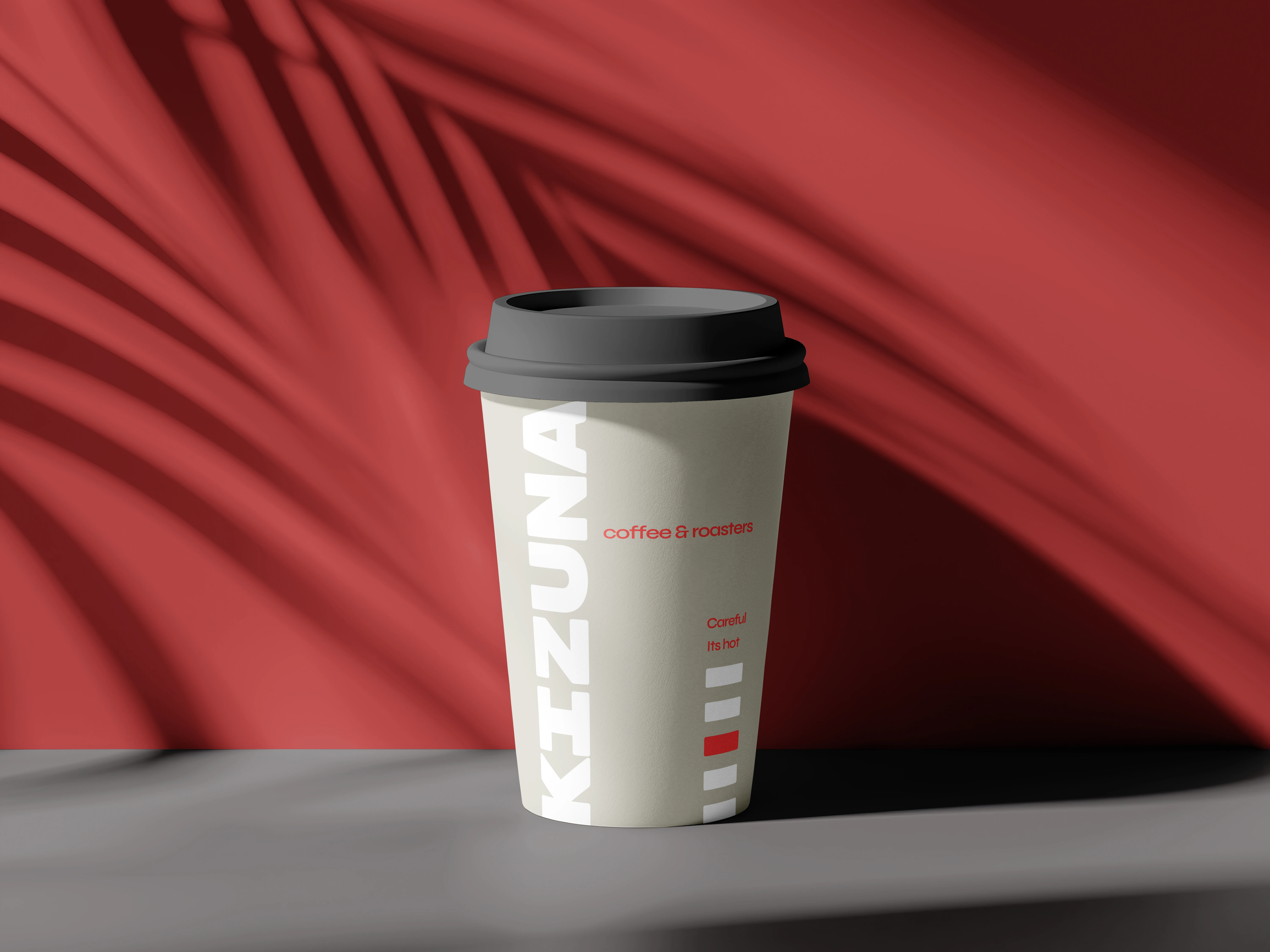
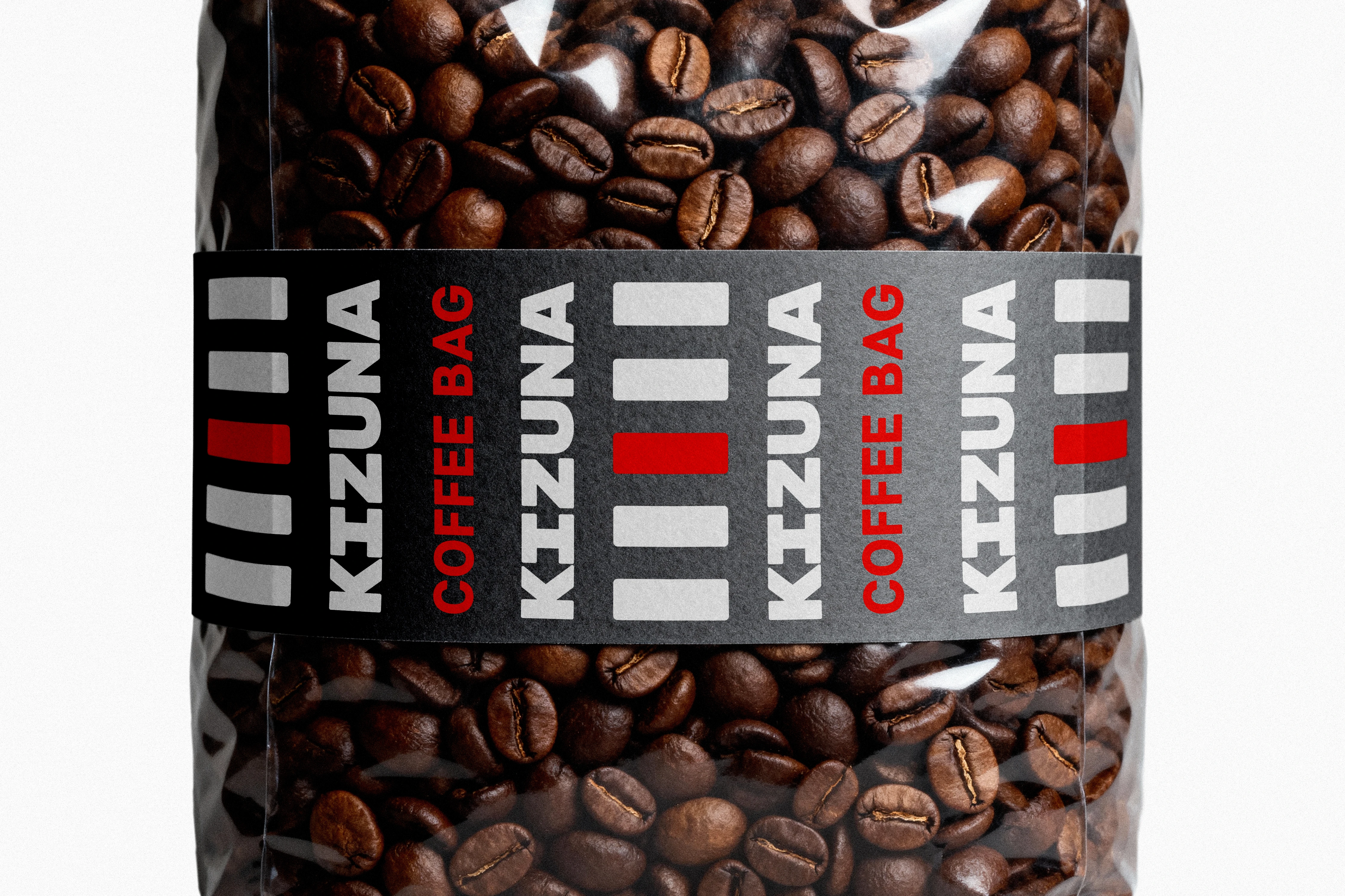
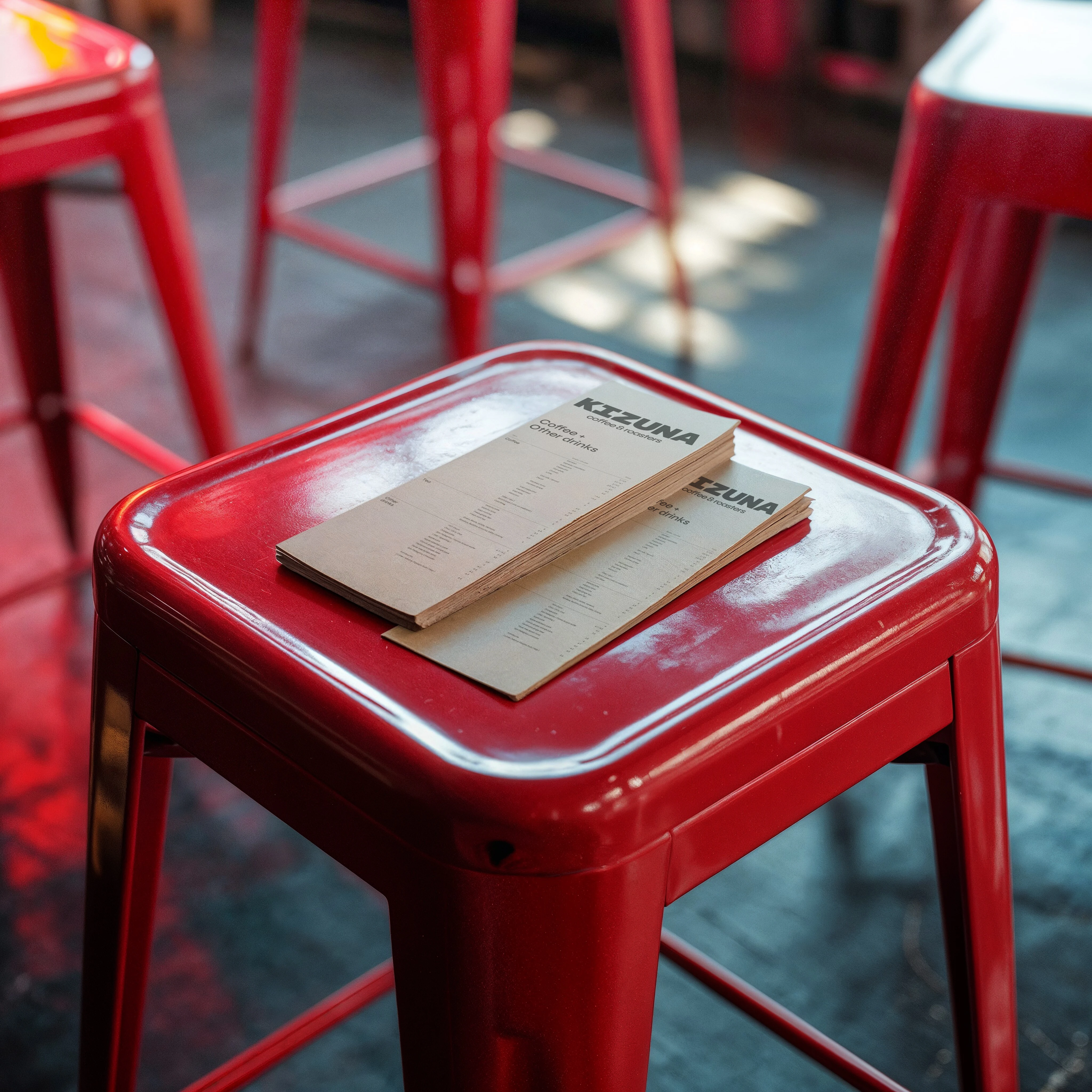
Three inks and no more than two per piece: on white it is black and red, on black it is white and red. Red is the only signal and the only color the printer has to get right. The cream is not there for warmth but to step back: a cold white would compete with the black and the red, and the system needs one thing speaking at a time.
- A cold, solid white as the neutral
- A palette of earth and warm tones, from the dominant register of the category
- BaseDeep Black#000000
- NeutralCream#CBC8B9
- AccentElectric Red#F5332C
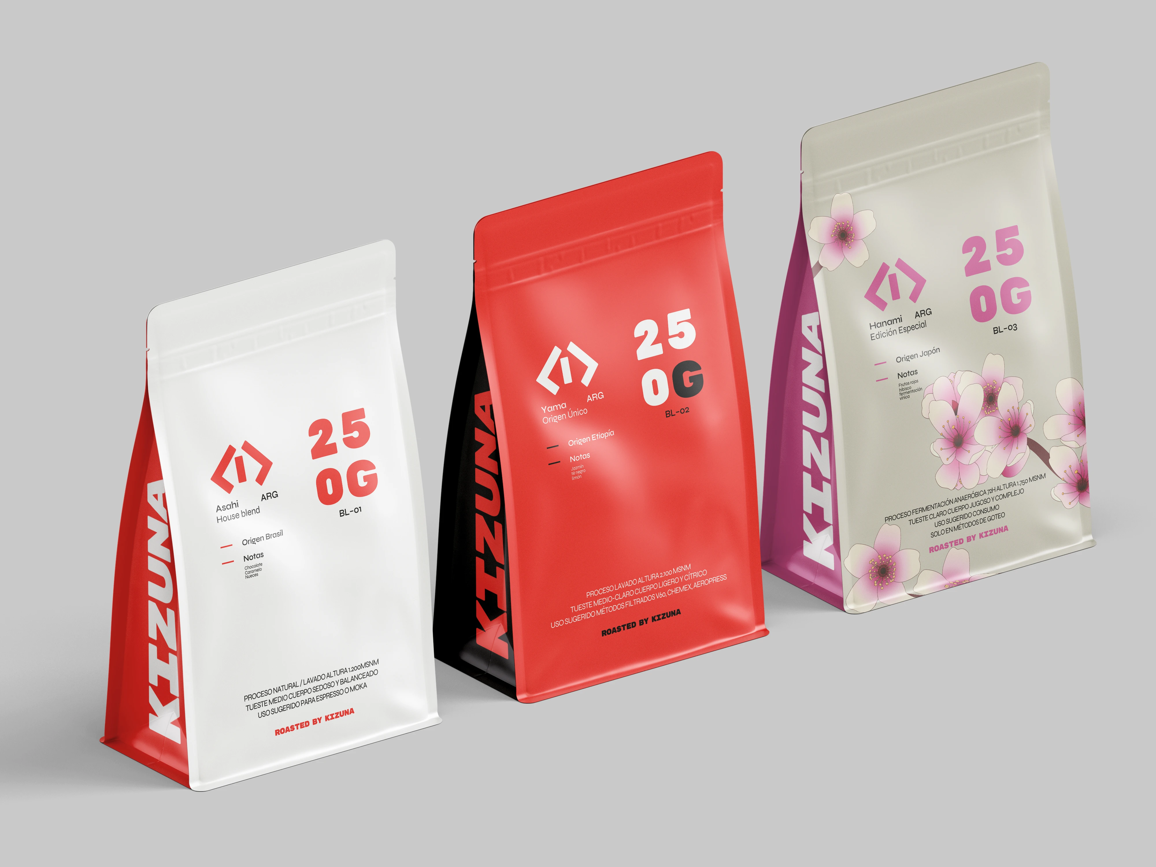
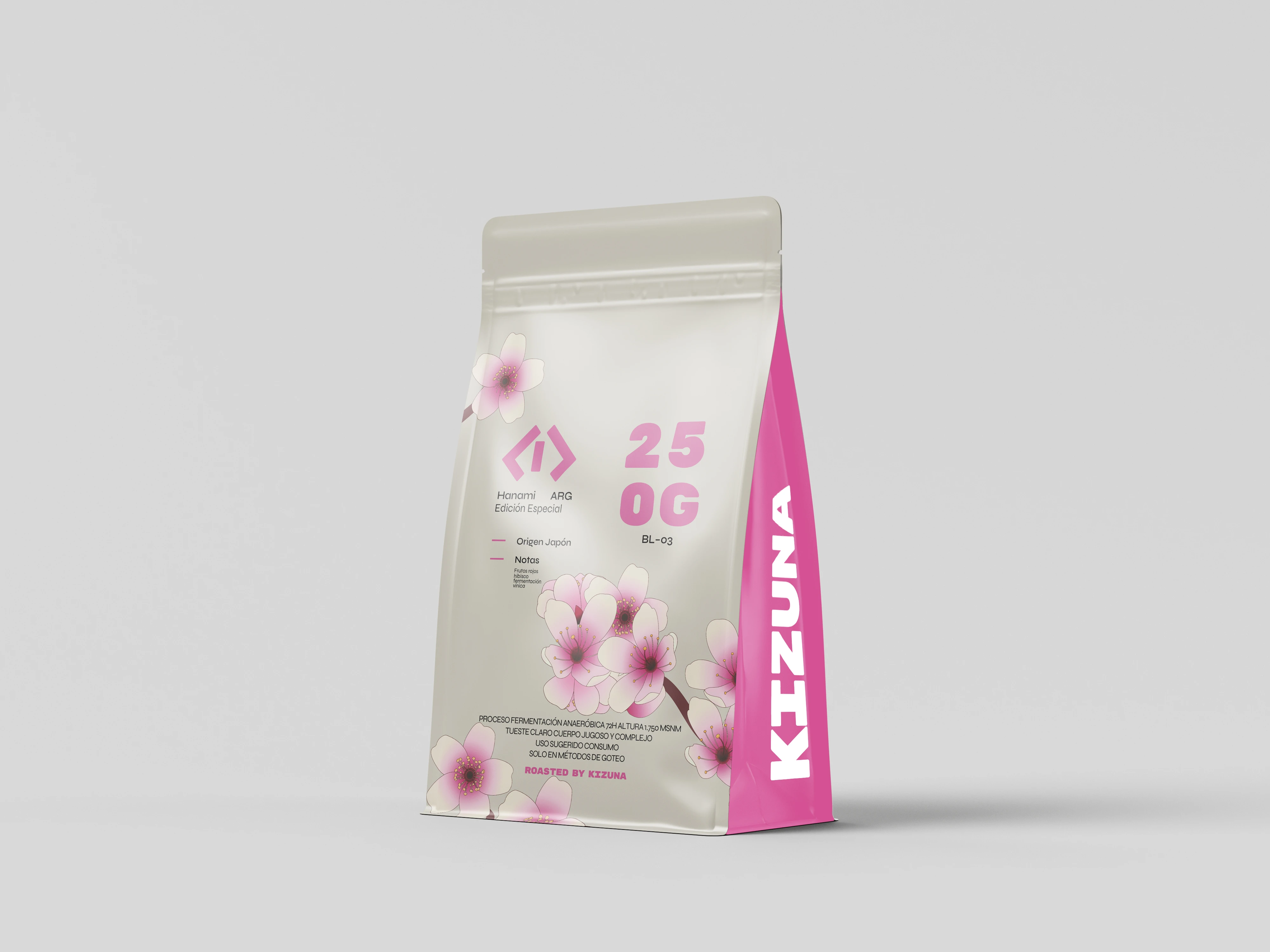
Special edition
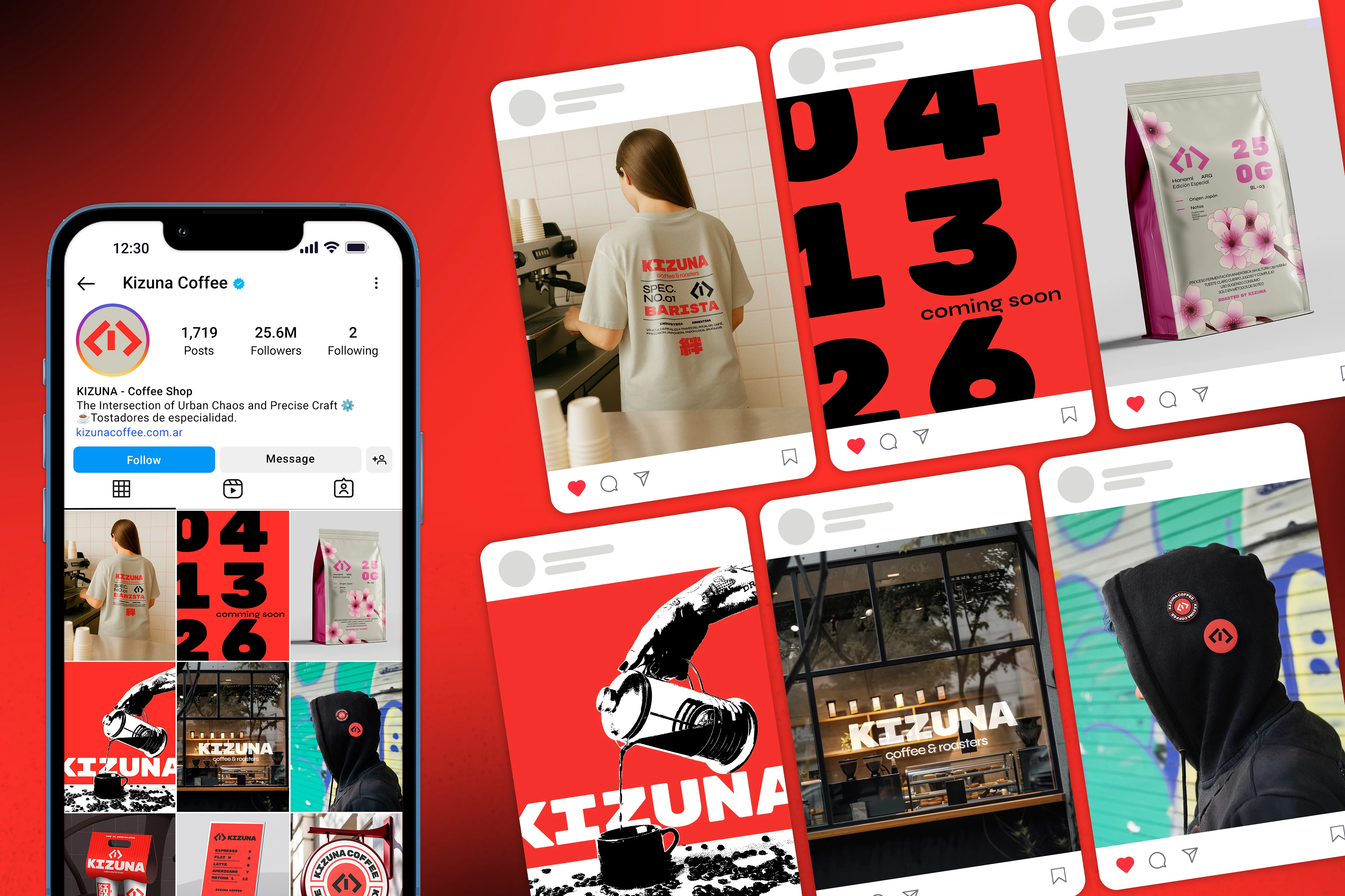
Hanami
BL-03, special edition
The only point where the system steps outside the high contrast palette and the technical language.
The exception is coded rather than improvised: it keeps the information architecture of the family and changes only the color layer and the illustrative device. It shows the system can take a seasonal variant without losing the read of the whole.
Process
How it was solved and what it was measured against
- No client, no budget and no deadline: a fictional, self initiated project, so the only constraints are its own
- The mark had to be built from primary shapes, to be memorable and producible as a stamp
- One color, and a primary one: a signal against the dominant pastel, and cheaper to produce
- The whole language had to come out of the Japanese and Buenos Aires crossing, with no borrowed codes
Mark
A geometric synthesis of the crossing lanes, built from primary shapes and derived from the stem of the primary typeface
Frente a: Drawing the symbol separately from the typography · A figurative mark
Coming out of the stem means symbol and wordmark share a construction, which is why they close together instead of just coexisting. The primary shapes come from the production constraint: a simple mark becomes a stamp and costs less.
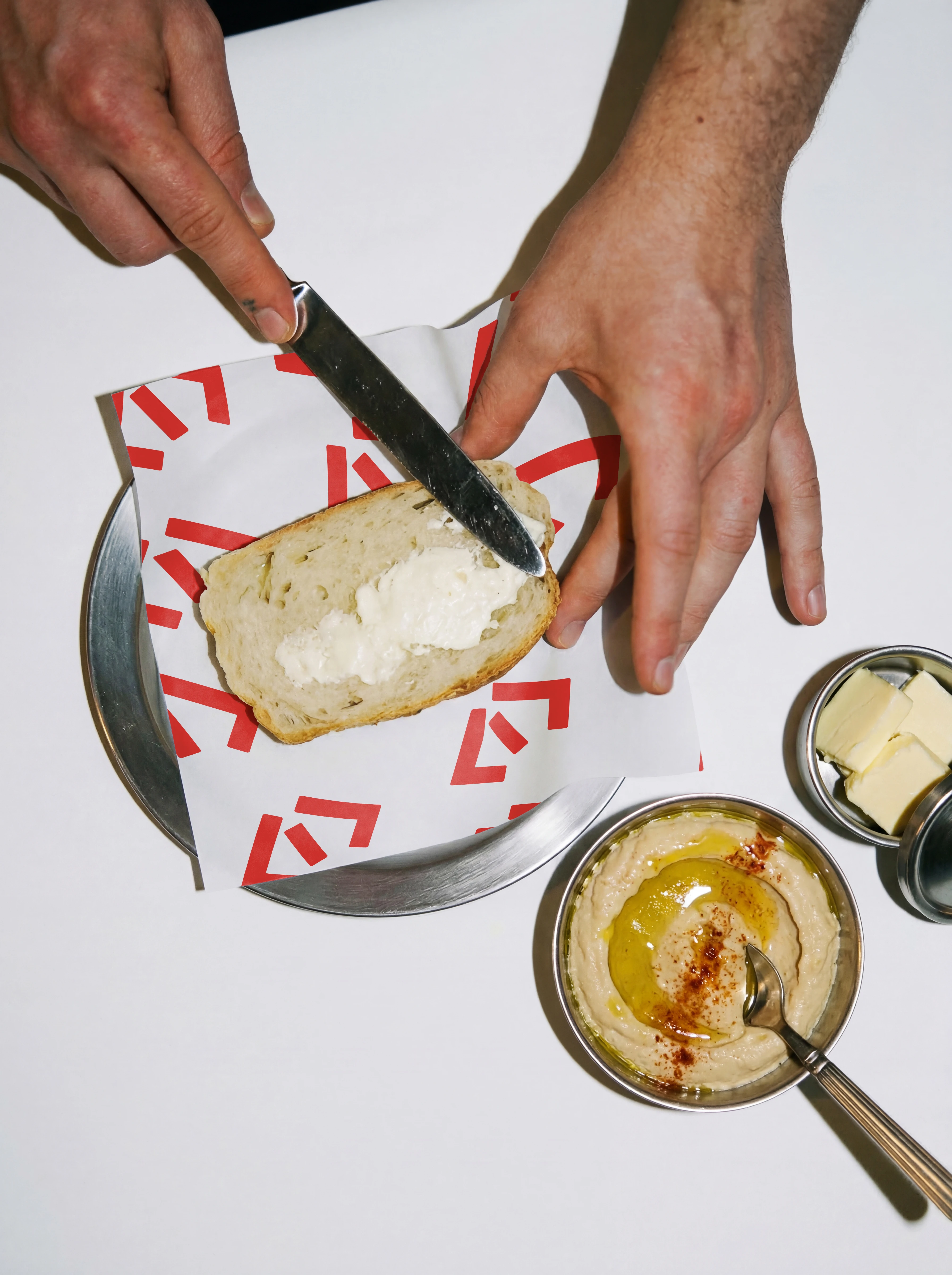
Specification pattern
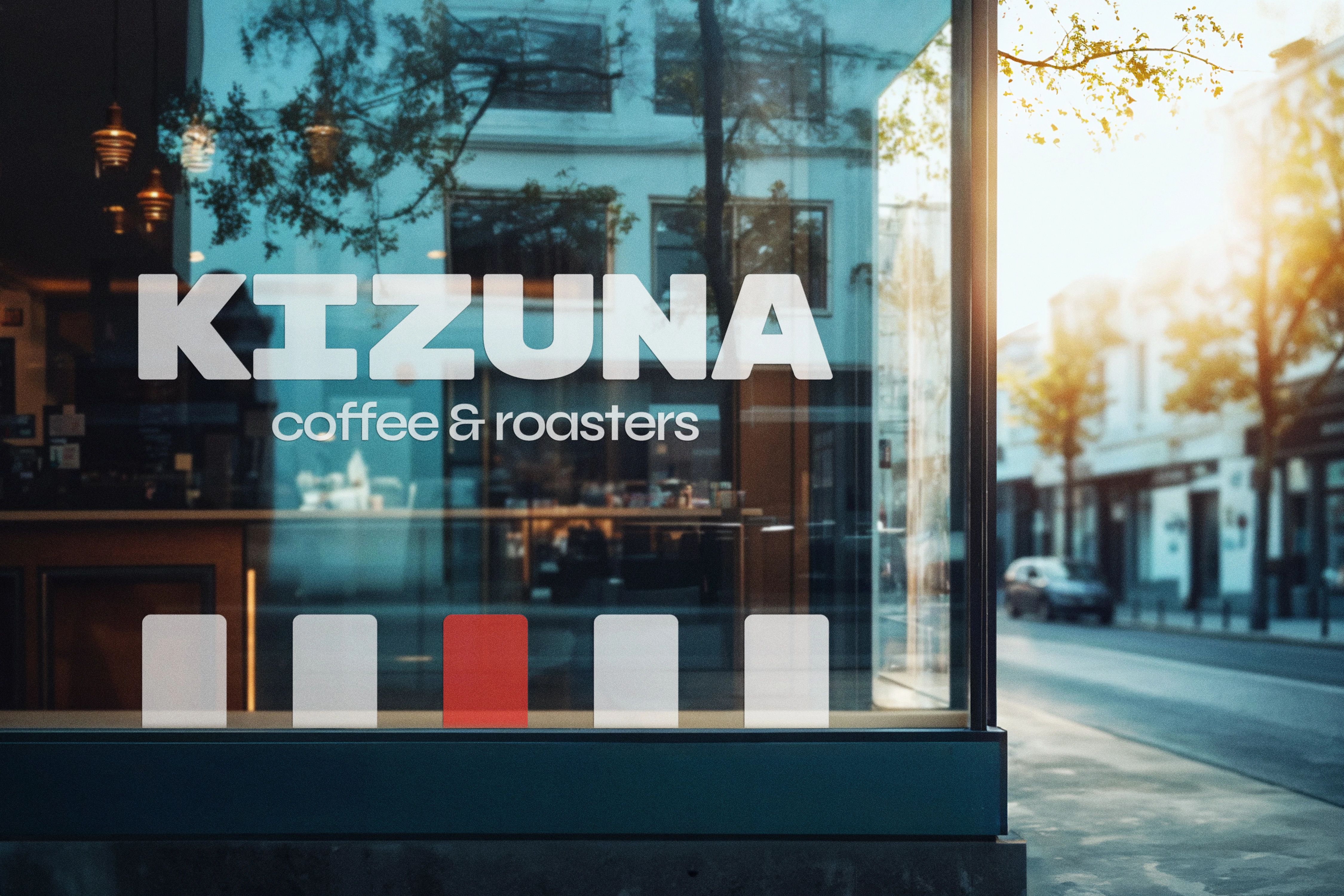
The lines of the pedestrian crossing, taken literally. Three lines, the middle one red.
Frente a: An illustrated mascot, which is the standard device in the category
The lines share the stem and the size of the symbol and the typeface, so the pattern is not an addition but the same system at another scale. The middle one is red so it reads as an element with hierarchy rather than as three squares.
Production
Three inks across the whole system, with a maximum of two per piece
Frente a: A wider palette with more than one accent color
Red is the only color the printer has to get right, which brings the cost of the system down and reduces registration error.
- The Shibuya CrossingUrbanismNot as a Japanese postcard but for its mechanics: many trajectories crossing the same point without colliding.
- Spec sheets and industrial designProductThe language of grids, specification labels and information ordered by standard.
- The almost Swiss brutalism in everyday use in JapanGraphic designAbsorbed as a general register, without specific references.
Next caseCompromiso Mujeres ConscientesBrand identity and visual system · 2026