Dvour
Brand identity and system
A real predator does not announce itself
The gaming peripherals market is undifferentiated on two levels at once: the products look like each other, and so do the brands selling them.
Gamers, streamers and digital creators between 18 and 50, mid to high income, who research a lot before buying and value premium technology. They reach the brand through online sales and selected physical stores.
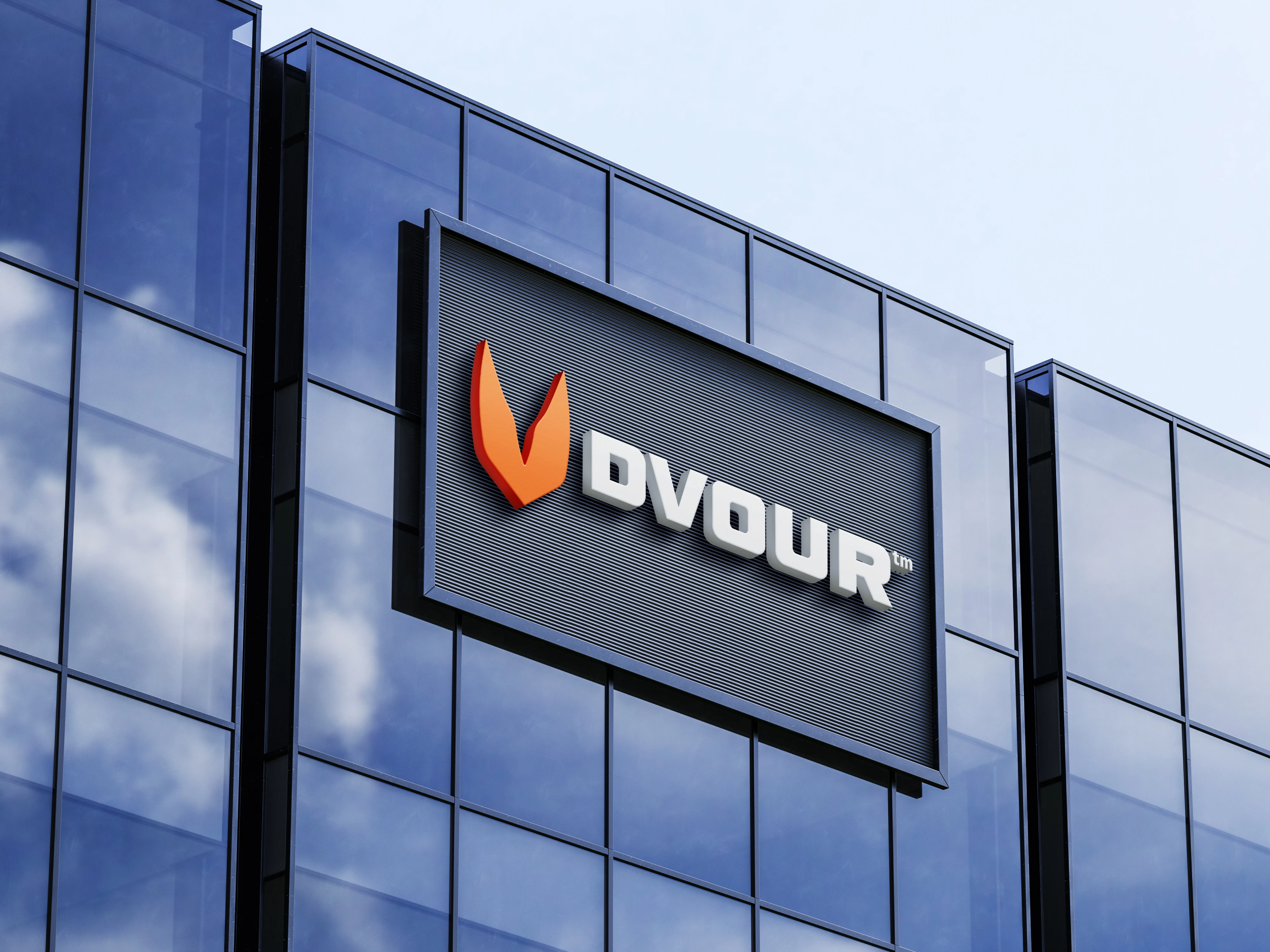
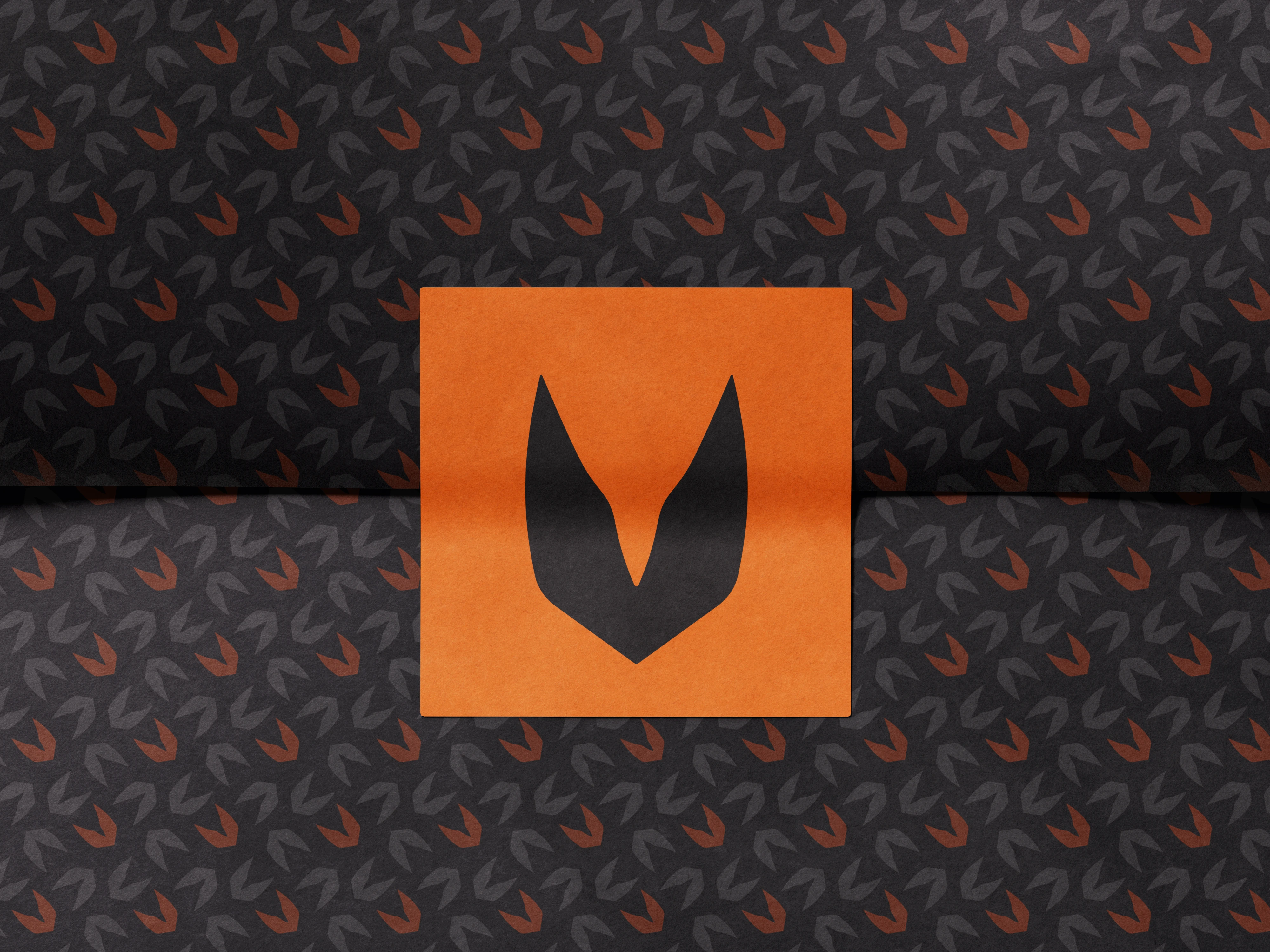
Dvour starts from a name. The idea was a brand that came to eat the market, which gives you devour, DVOUR, and with the name the symbol: a hunting canine tooth, the one only predators have.
The gaming peripherals market is undifferentiated on two levels at once. The products look like each other, and so do the brands selling them, so the real difference ends up living on neither side. Dvour does not try to solve that by breaking the category. It is a brand built to fit in, signalling premium from the inside, and it rests its difference on the product: exclusive materials such as carbon fibre effect finishes, at competitive market prices.
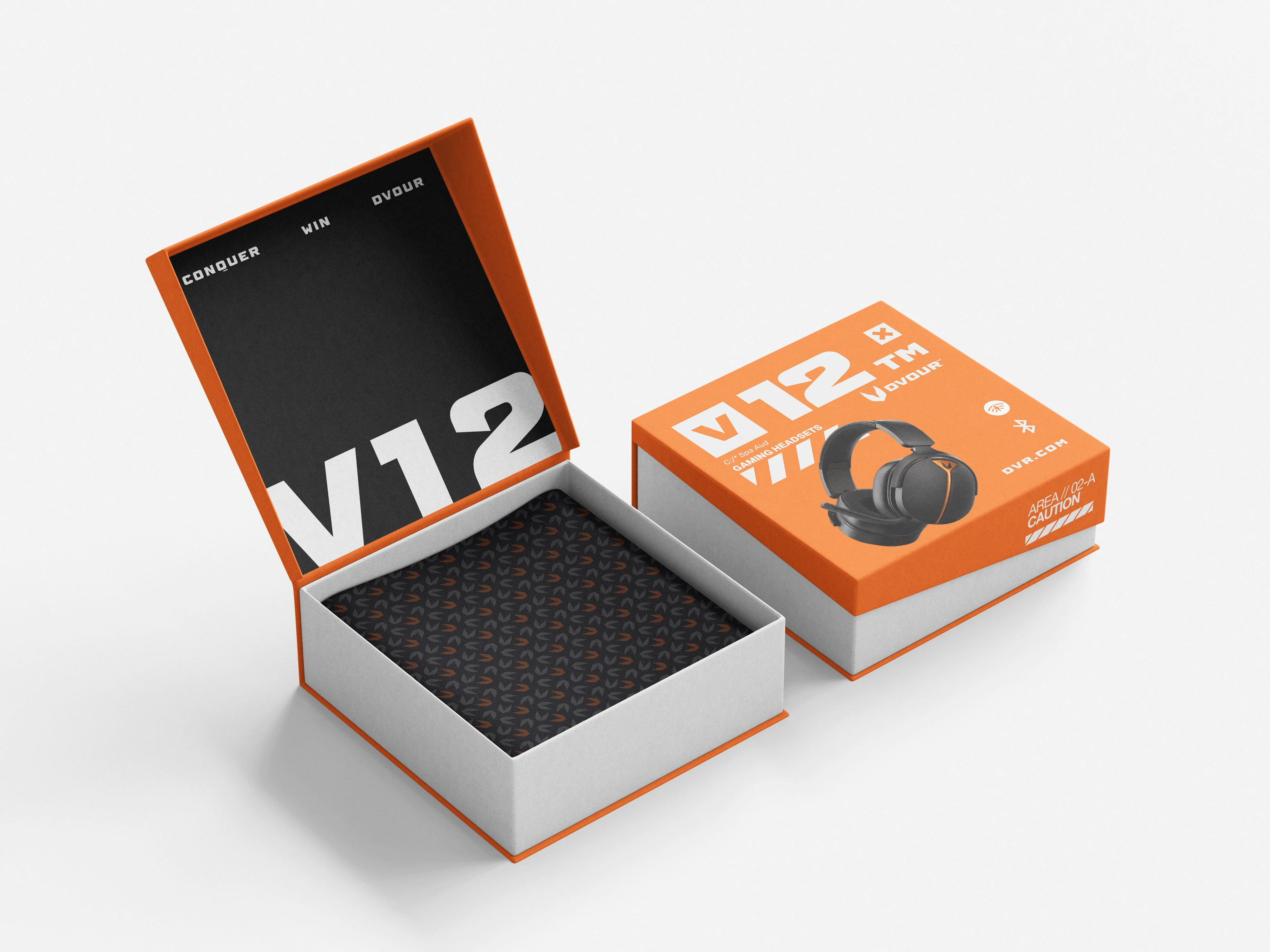
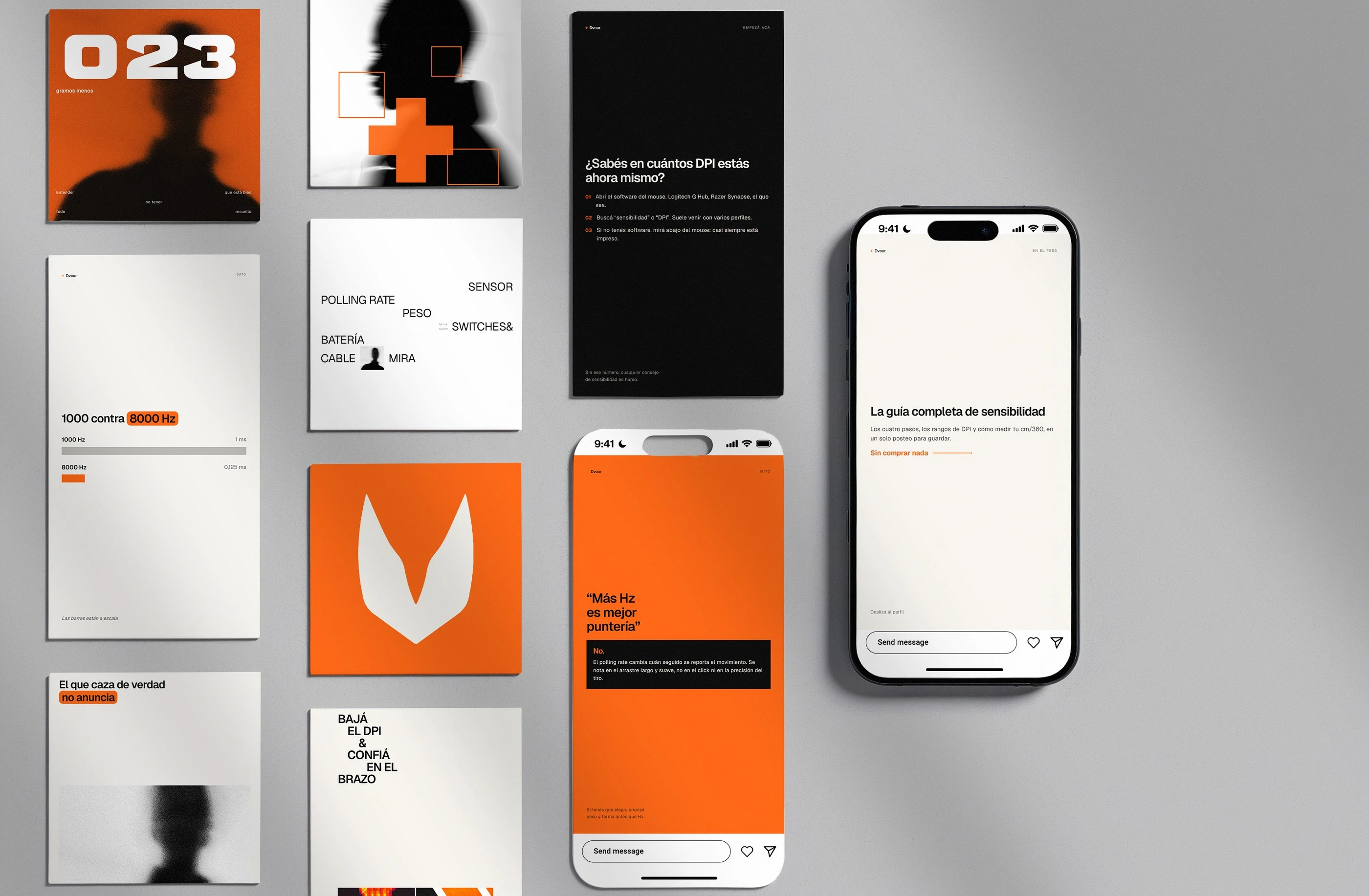
That is why the system is restrained rather than loud. A predator that actually hunts does not announce itself, so holding back does not contradict the concept, it is the correct form of it. The orange works as a minimal signal rather than a shout, and that is what lets the brand belong to the category without adding to its noise.
The reference underneath comes from high end motorsport, where carbon fibre is not decoration but proof that the car performs. Material as argument, not as finish.
The tooth
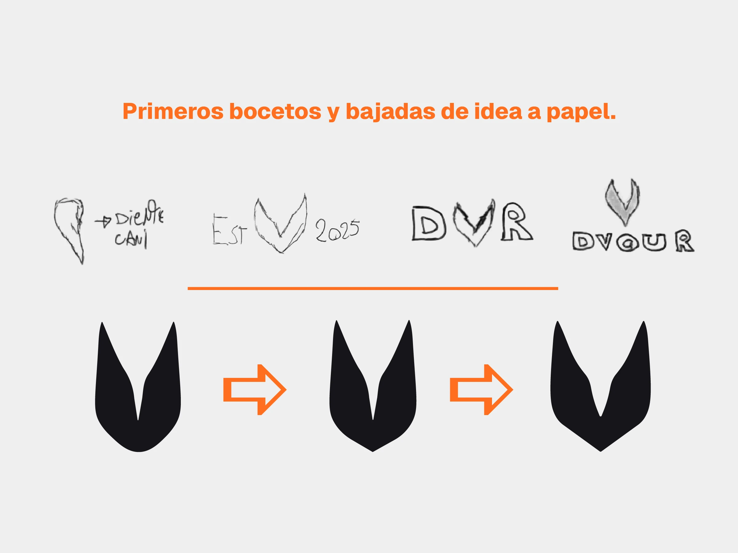
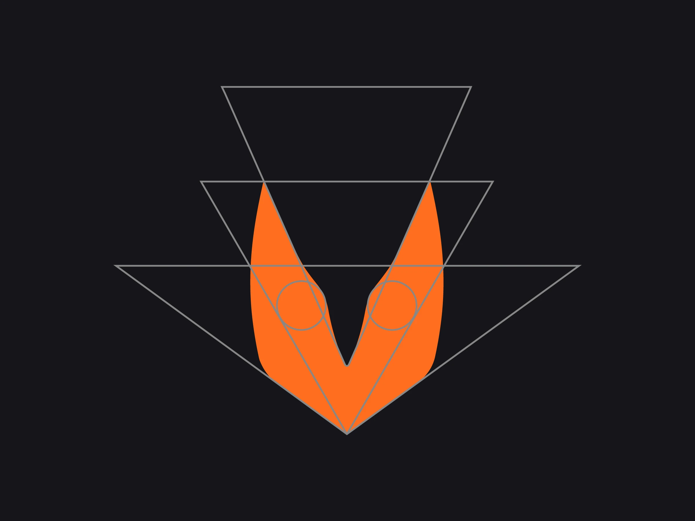
The name comes from devour. The symbol is a hunting canine tooth, the one only predators have, resolved into a V after the initial.
The V is not an accident of the drawing. Dropping the E from DEVOUR breaks the word somewhere that is not its natural break, and that irregularity is deliberate.
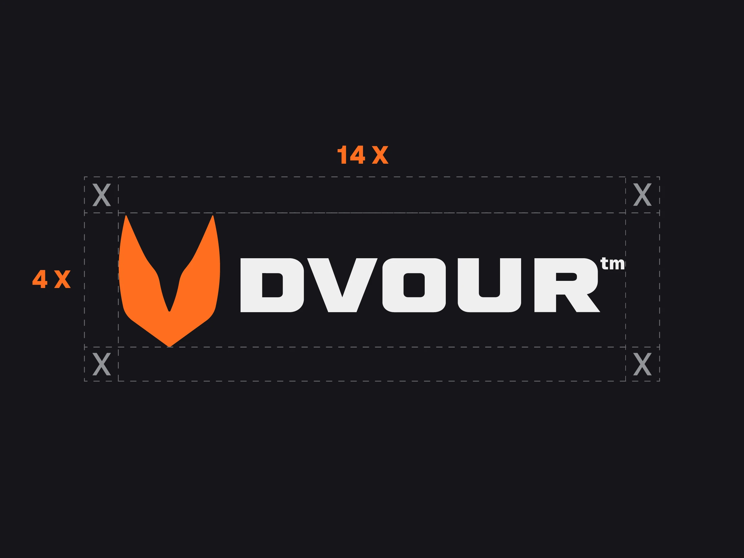
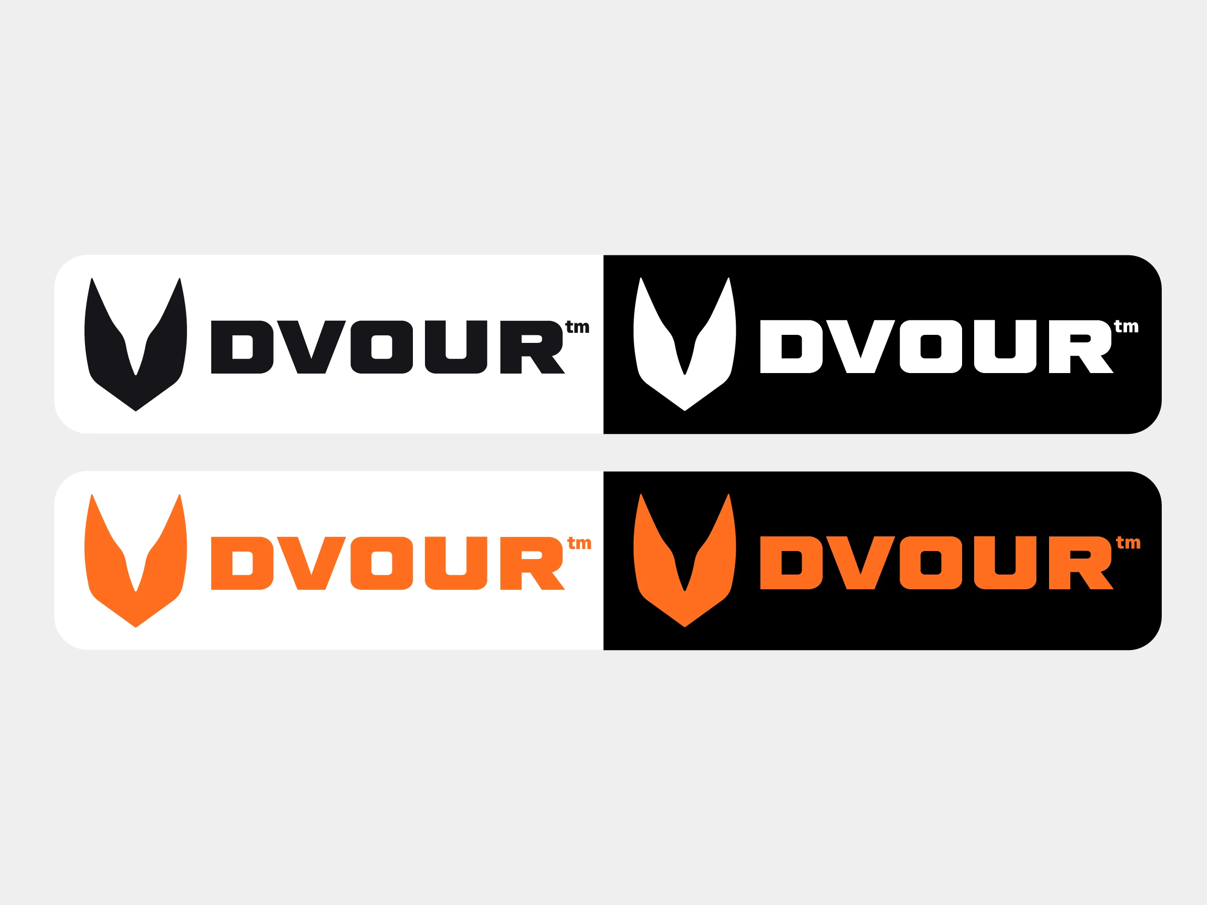
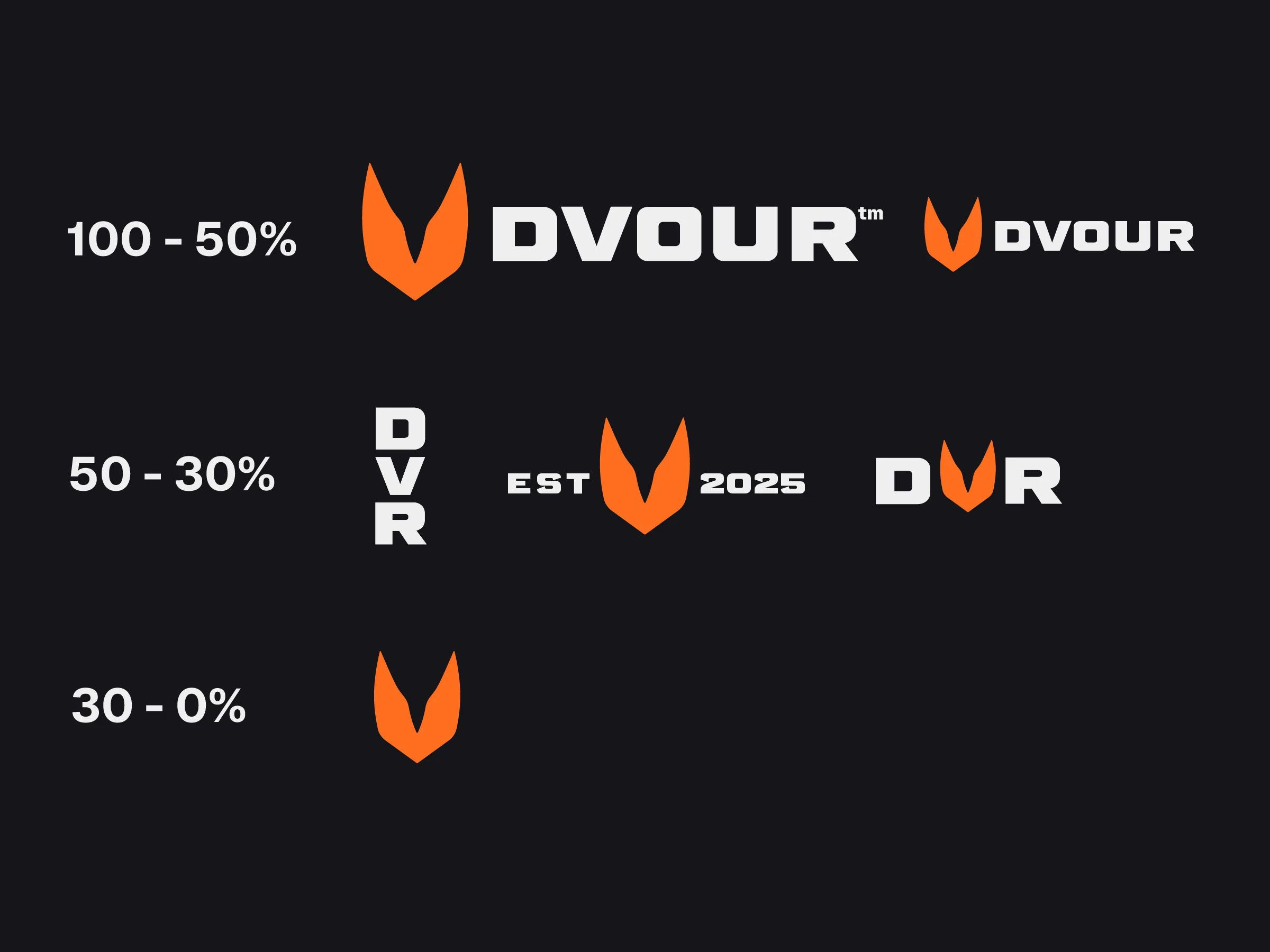
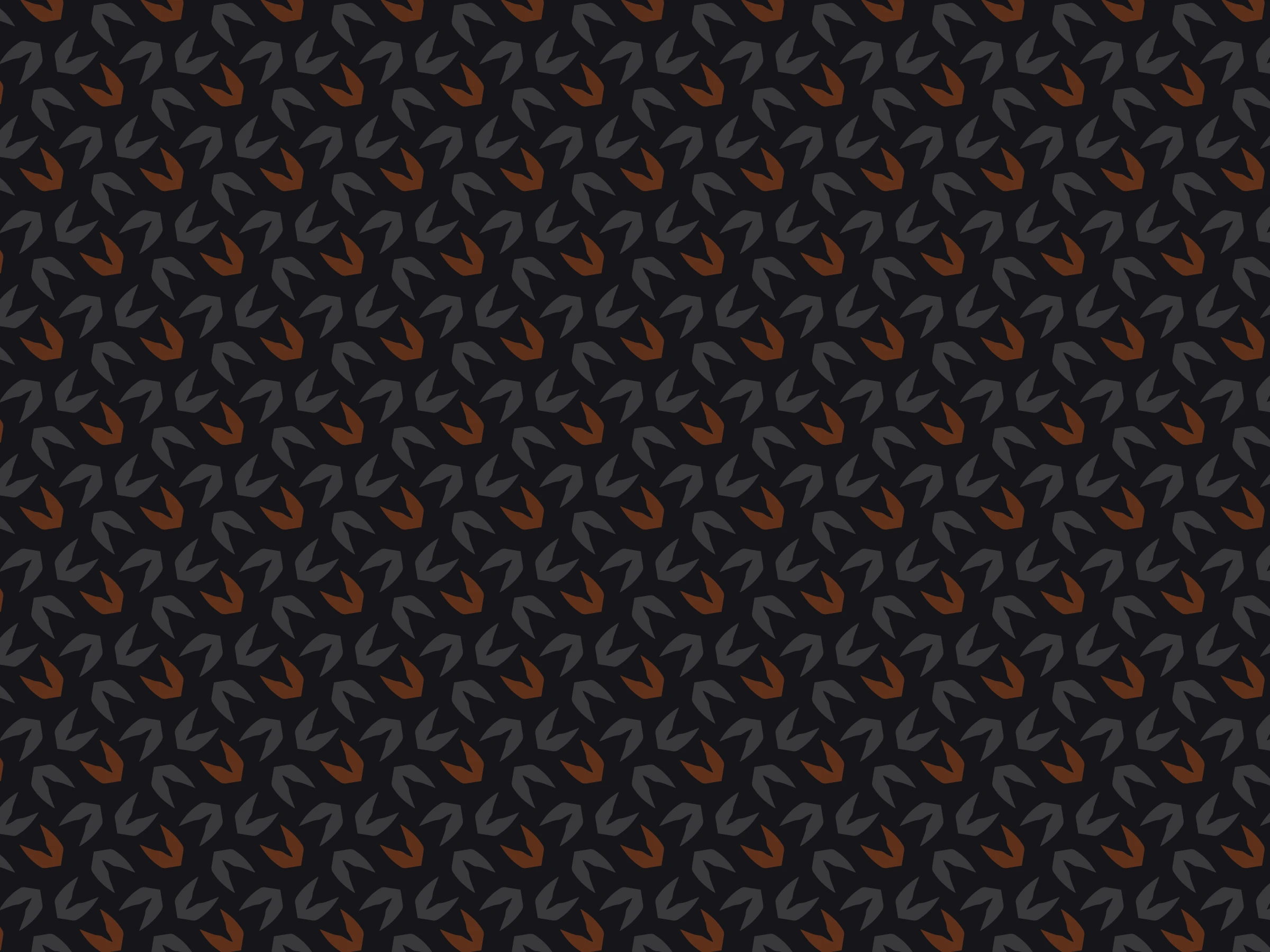
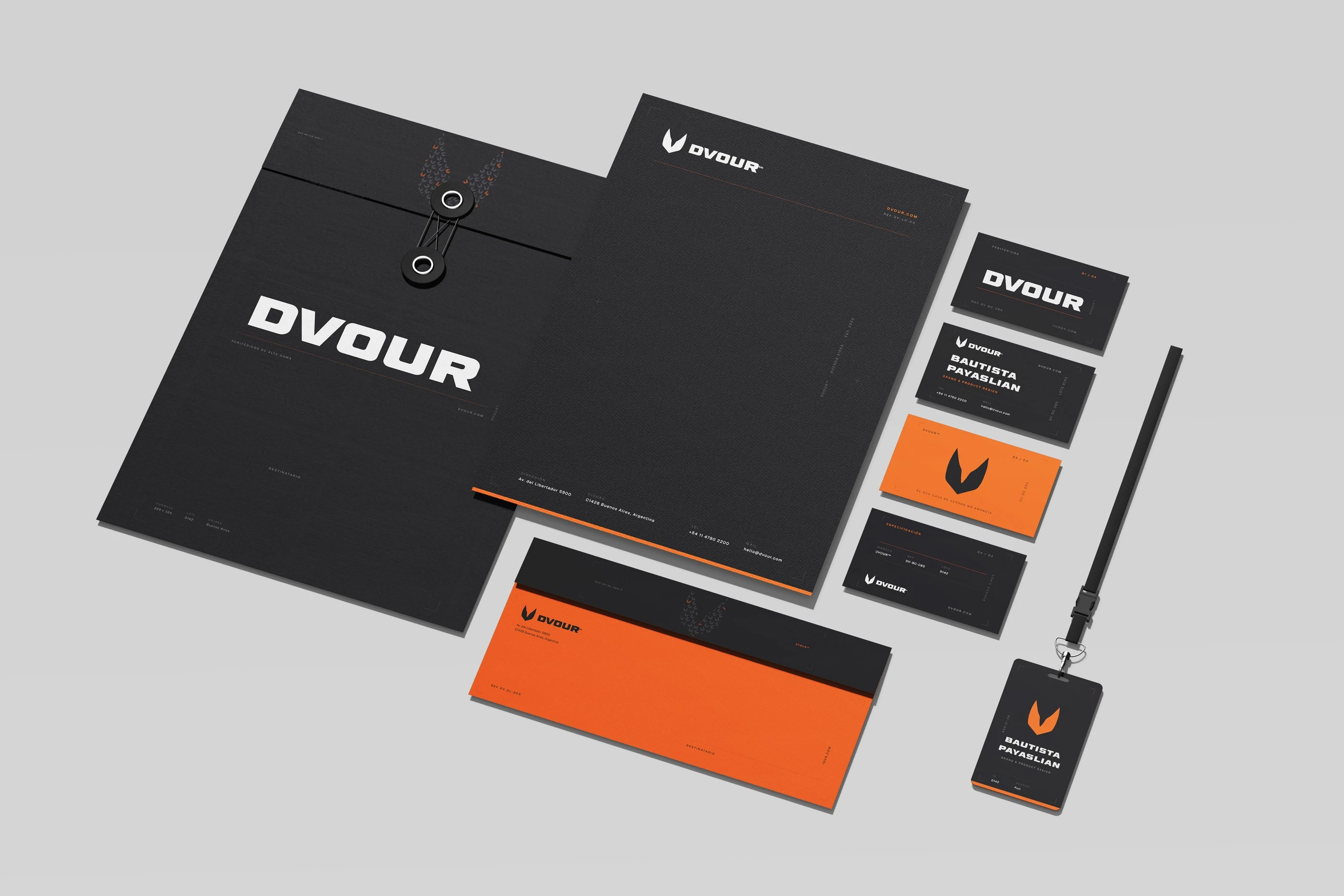
The orange is the predator's signal and the only color that speaks. The rest of the palette supports it as complementaries and neutrals, holding the restrained register the brand needs in order to belong to the category without joining its noise.
- SignalOrange DVOUR#FF6E1F
- ComplementaryTawny#D95200
- NeutralTaupe Gray#878787
- BackgroundModern White#EFEFEF
- BaseChinese Black#161519
Process
How it was solved and what it was measured against
- Course project: Marcas y Envases, first term, with a brand manual as the deliverable
- No constraints of its own. The project started from a name concept and was built on top of it
Name and mark
DVOUR, from devour. The symbol is a hunting canine tooth, the one only predators have, resolved into the shape of a V.
The idea is a brand coming to eat the market, so the name, the concept and the shape are all the same thing. The V is intentional rather than accidental: dropping the E from DEVOUR breaks the word somewhere that is not its natural break, and that irregularity is the point.
Register of the system
Restraint and contrast, working with the codes of the category instead of against them.
Frente a: An aggressive system, pitched at the tone of the category
A predator that actually hunts does not announce itself, so restraint does not contradict the concept: it is the correct form of it. And the brand is not trying to break the category, it is trying to belong to it while signalling premium from the inside. What finally sets the brand apart is the product, not the graphics.
Typography
Barber Fill as the primary face, Geist for text.
It needed a heavy, slightly condensed sans that could carry the weight of the symbol. The relationship between mark and typeface here is one of weight, not of shared construction.
- High performance motorsportProductSupercars use carbon fibre as a signal of performance, not as an ornament. Dvour borrows that logic: the material is the argument.
- The premium peripherals categoryGraphic designGeneral absorption of the category, documented in the moodboard inside the manual.
Next caseKizunaBrand identity and visual system · 2025